Zero Waste Scotland
Translate 3 offline carbon emission calculation tools into an online resource.
Challenge
To review the current tool formats (a range of google forms, excel and word documents) and design a solution that would provide all three, in an easy to use format.
Solution
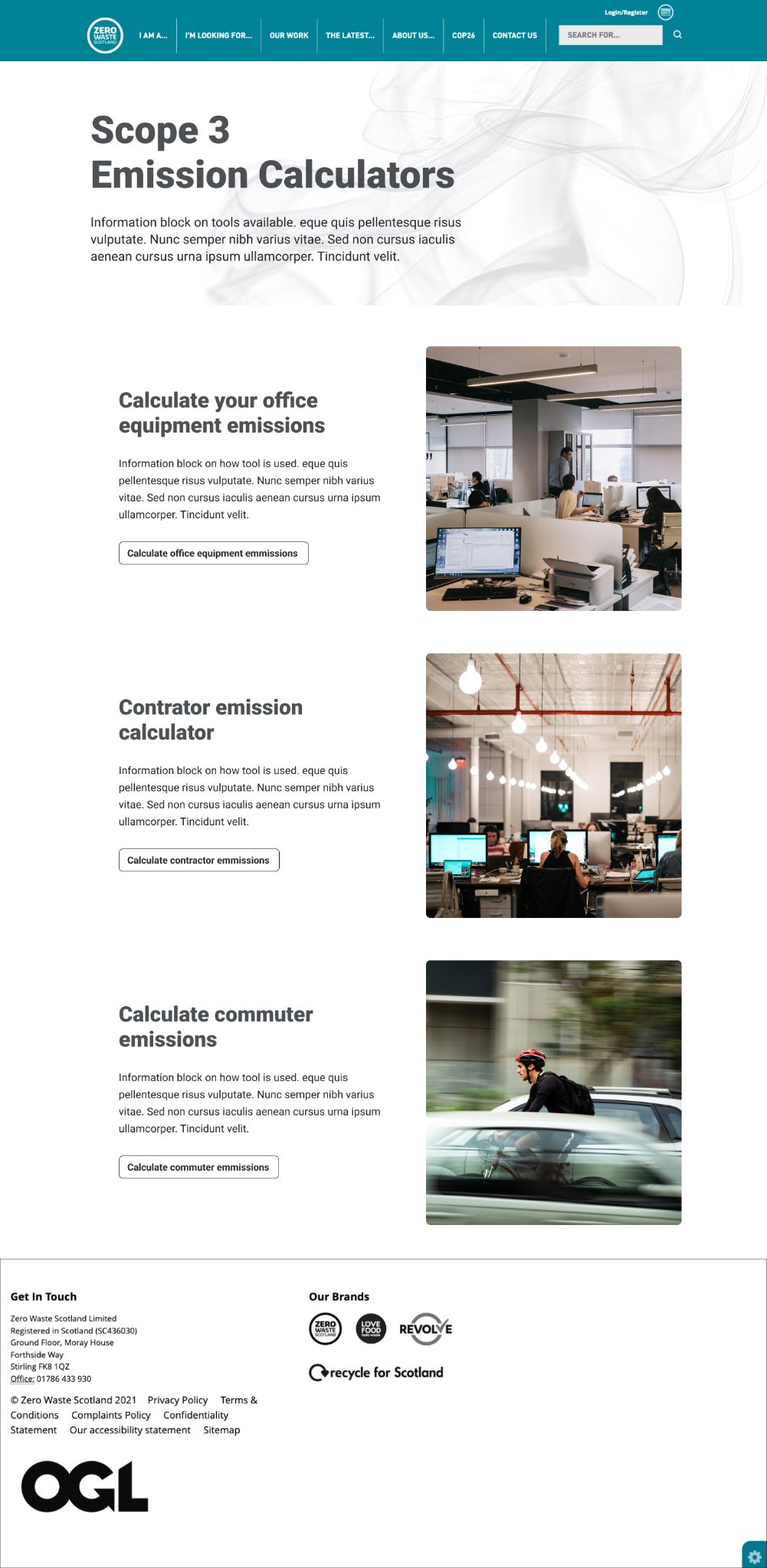
A webpage that houses all three calculation tools in one place, with clear instruction and guidance on how to use each, as well as additional result formats, so businesses can easily download and drop results into reports etc.
The problem
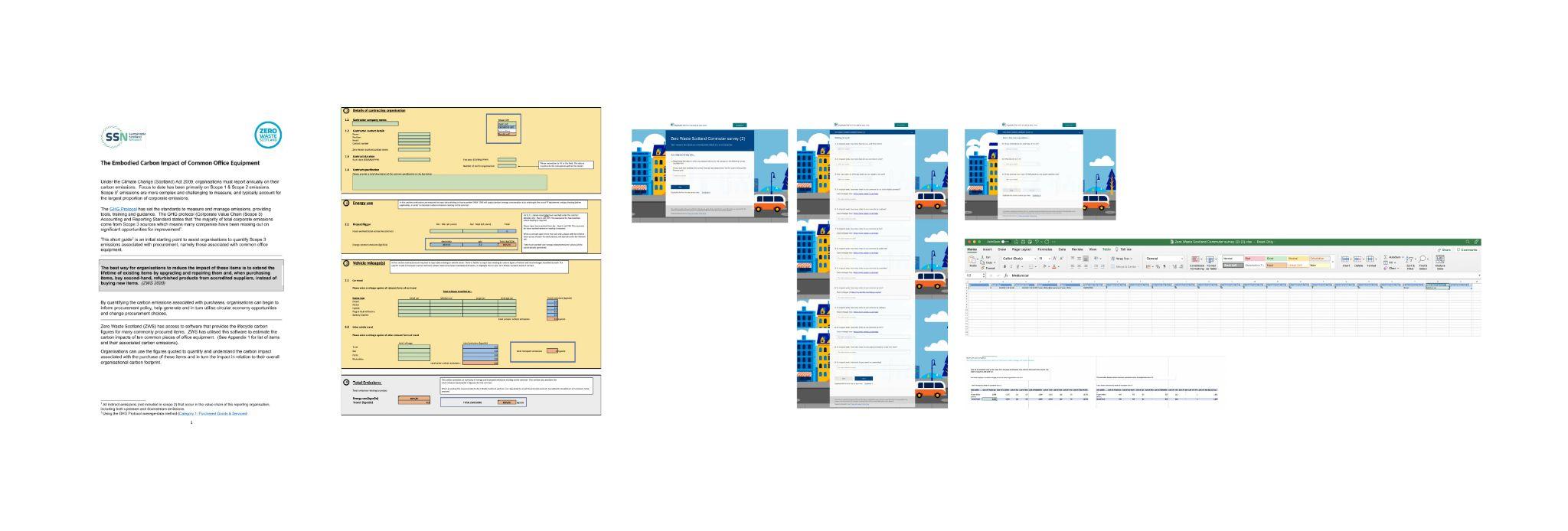
Zero Waste Scotland were currently using 3 offline tools to calculate carbon emissions for 3 different use types:
- Calculating office emissions
- Calculating contractor emissions
- Calculating commuting emissions
These were in a variety of excel, google form and word doc formats and were provided to businesses as a free resource for them to calculate and ultimately reduce their carbon emissions over time. The tools were functional but not overly intuitive, they wanted to revise the tools and create an online offering to reach more businesses and provide a better service through a better product/resource.
Discovery: Research & Analysis
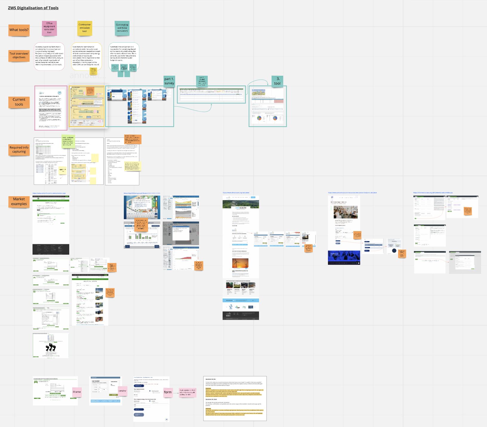
I began by reviewing each tool, listing key functionality to better understand any commonalities that would help in creating tools that were intuitive individually, as well as as a set.
Next I researched the current market for tools like this to see if there was any best practice or expected functionality we were missing to make sure the tool we created was able to go a step further than its current state, if that would improve UX.
Development: Defining user journeys
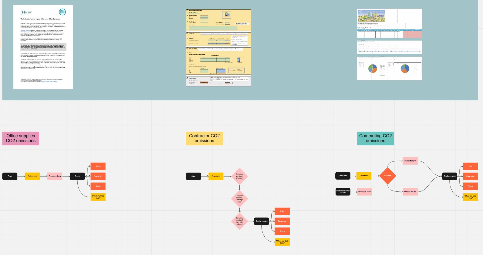
Understanding how users would use the tools was key in developing something that fulfilled both need and value.
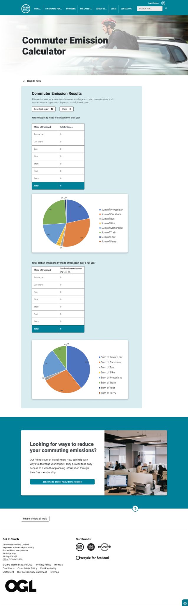
As most users would be using the tools in a work environment, a streamline and easy to use approach was key to minimise time and increase efficiency. The ability to download results, to easily insert into reports was key.
We were able to take this one step further with visual aides (pie charts) after working closely with the developers to get the most out of what was possible.
These journeys formed the backbone of internal testing, especially as the tools also included technical calculations happening in the background, so having clear steps was helpful to benchmark progress.
Designs
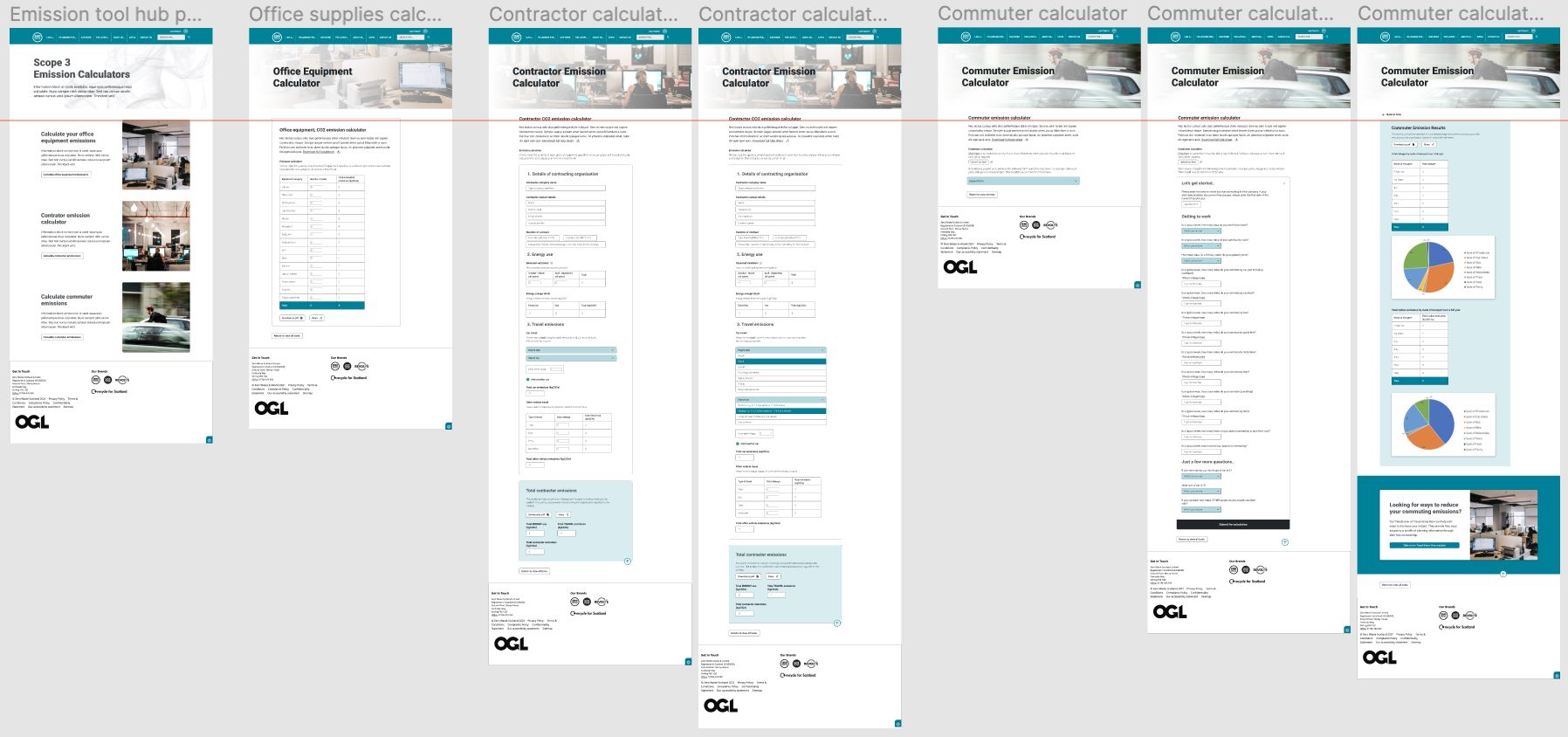
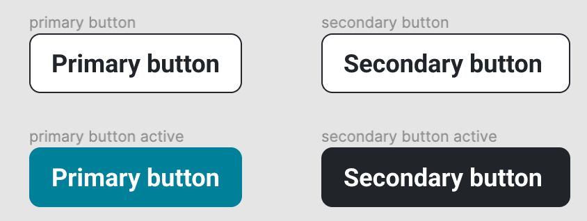
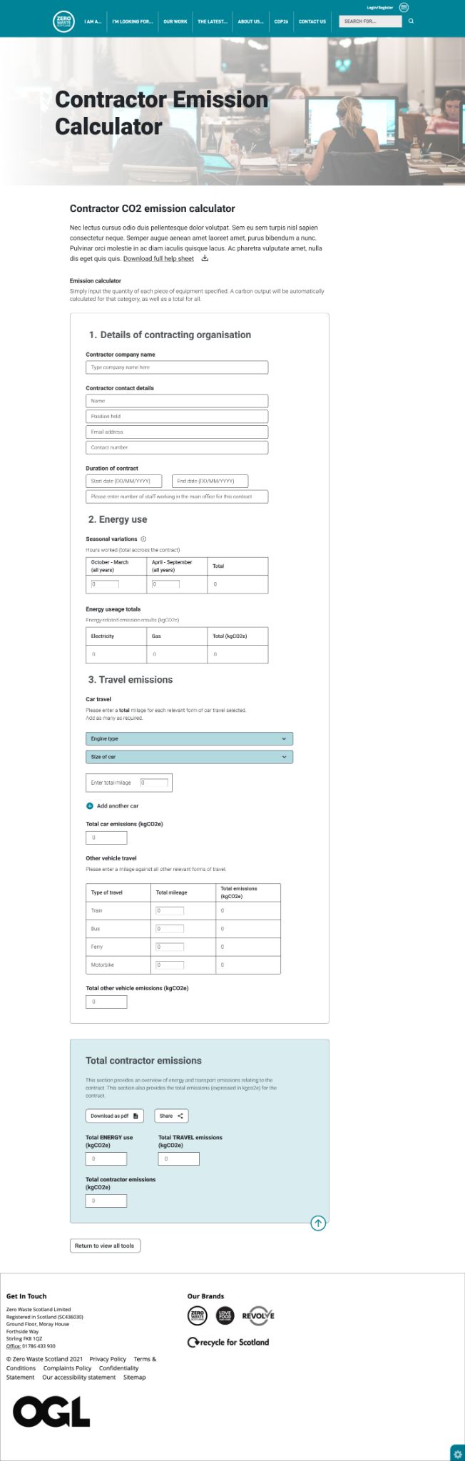
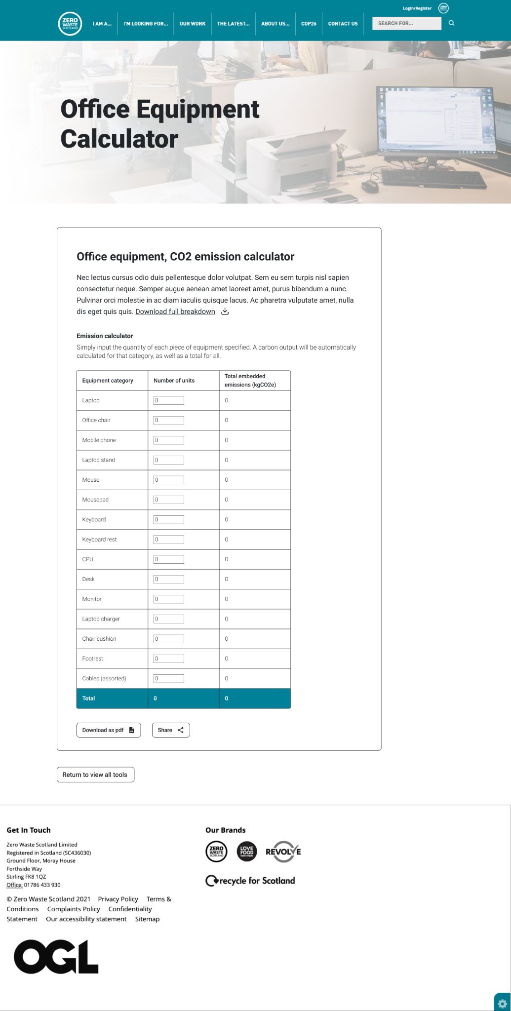
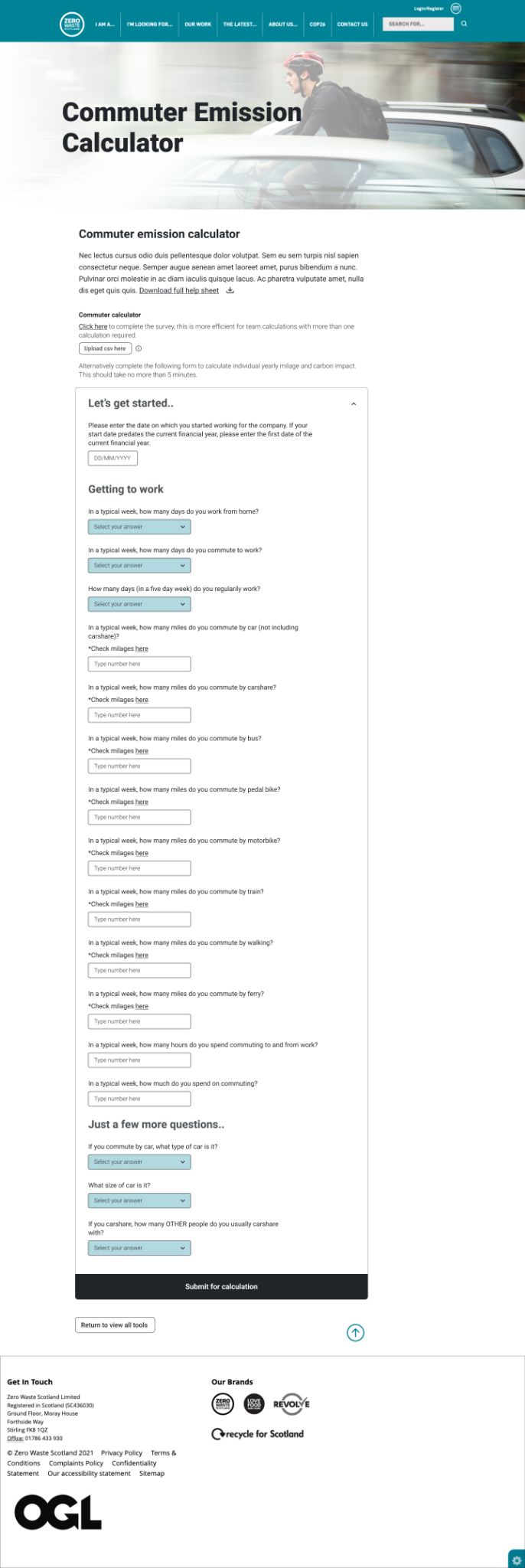
I designed a hybrid wireframe that incorporated some styling to the forms as there was not going to be any saturated UI element to detract from the main use of the forms. The designs were functional and adding unnecessary UI would not add value to the UX.
We were limited on design time as the technical set up of calculations in the back end was key to the success of the tool. I enjoyed the task of creating an intuitive and consistent set of tools that was really solely about the functionality and logic, the problem solving.
Final thoughts and learnings
I really enjoyed this project as the focus was on problem solving and functionality, to provide a great user experience. It also allowed a close relationship with the dev team as I needed to make sure all the form fields and key functionality I was adding would work with the backend calculations.
This is a great example of a project where you need to work together to understand not only the requirement but also any constraints.