Visit Scotland
Information architecture and user journey optimisation.
Challenge
To understand how effectively users could navigate key content and find the information they needed.
Solution
Using tree testing and user journey mapping to identify opportunities to improve information architecture and create more intuitive user journeys.
Results
A revised information architecture that would optimise user journeys and lead to increased site engagement as a result.
The Problem
VisitScotland’s website offers a wealth of information, but having the right content isn’t enough if users can’t easily find it.
We needed to understand whether the existing content hierarchy reflected users’ expectations and identify where the structure could be improved to support content discovery.
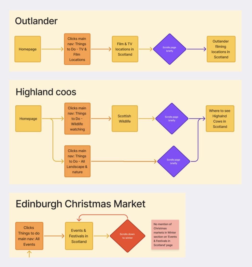
Key user journeys were identified using analytics (Contentsquare and GA4) alongside business priorities, these were then tree tested.
Discovery
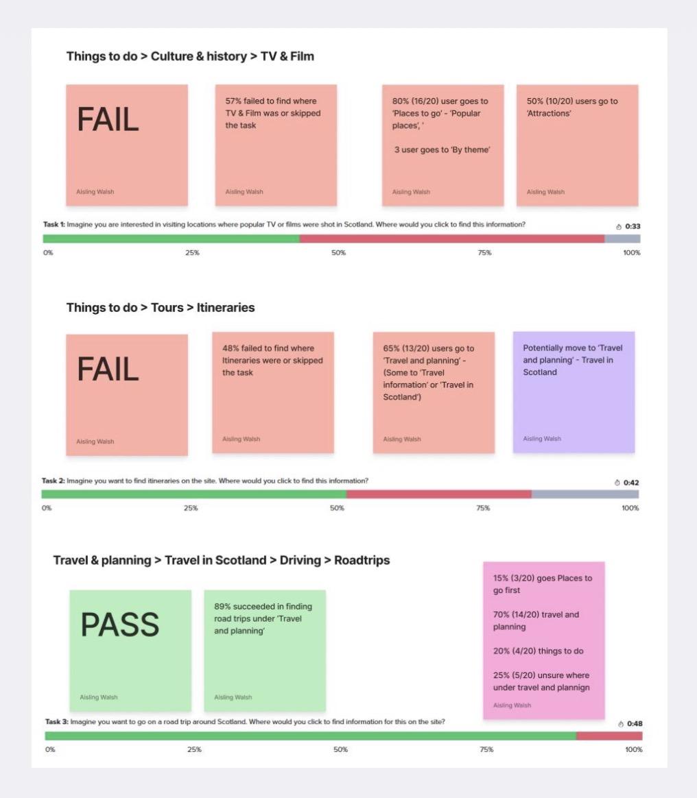
I led research combining tree testing and user journey mapping to evaluate the existing information architecture.
Tree testing highlighted where users struggled to locate information, while journey mapping helped identify opportunities to improve how content connected across the wider experience.
Key takeaway: Research revealed gaps between the existing content structure and where users naturally expected to find information in the menu.
Development
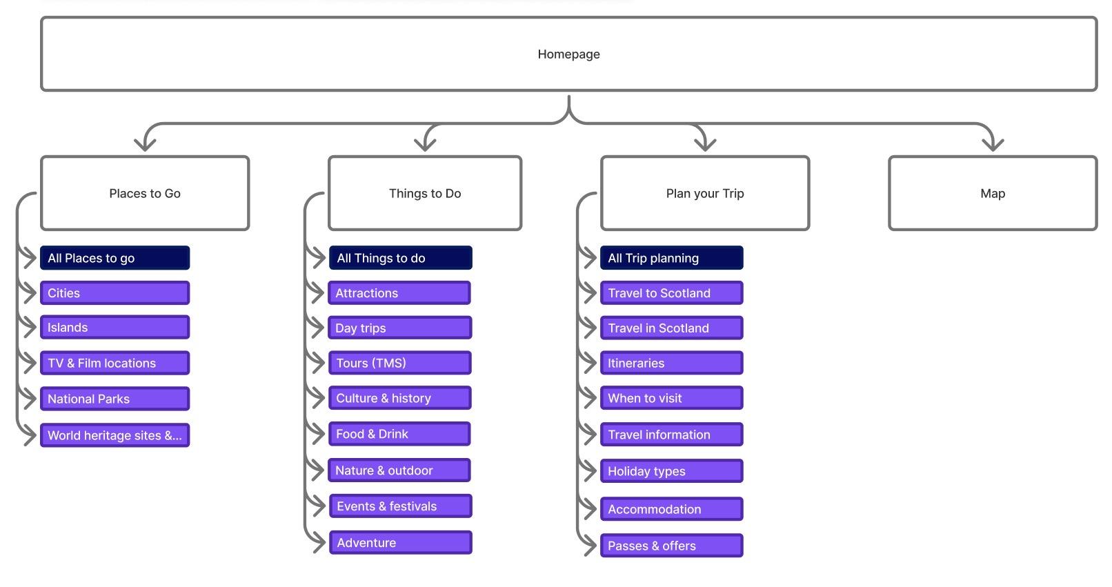
I analysed the research findings to identify opportunities to improve content organisation, placement and navigation (this was part of a wider site structure audit that was being done by myself, content and SEO managers).
I translated these insights into evidence lead recommendations, considered how changes to the information architecture could create clearer, more intuitive routes to information.
I presented the findings to stakeholders, to inform decision making.
Output
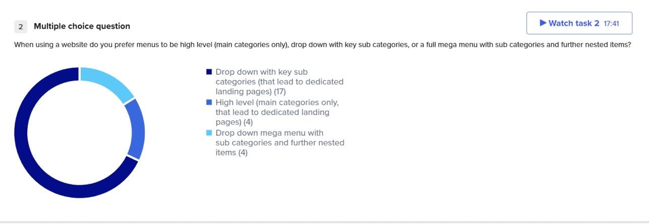
The user testing provided an evidence based foundation for improving the website’s menu and wider site information architecture.
My findings and recommendations were taken forward by the wider team, informing subsequent changes to content organisation and website structure.
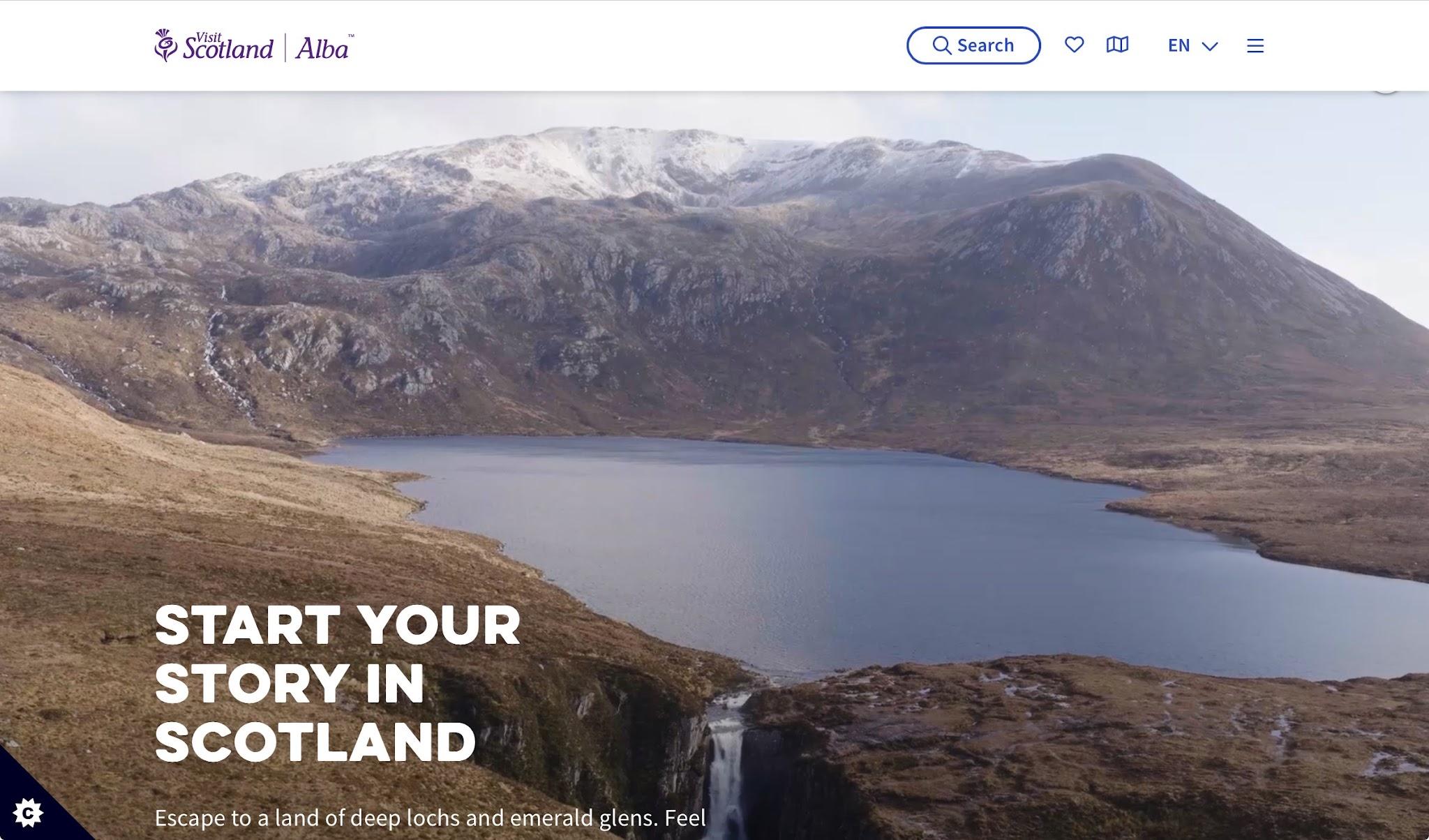
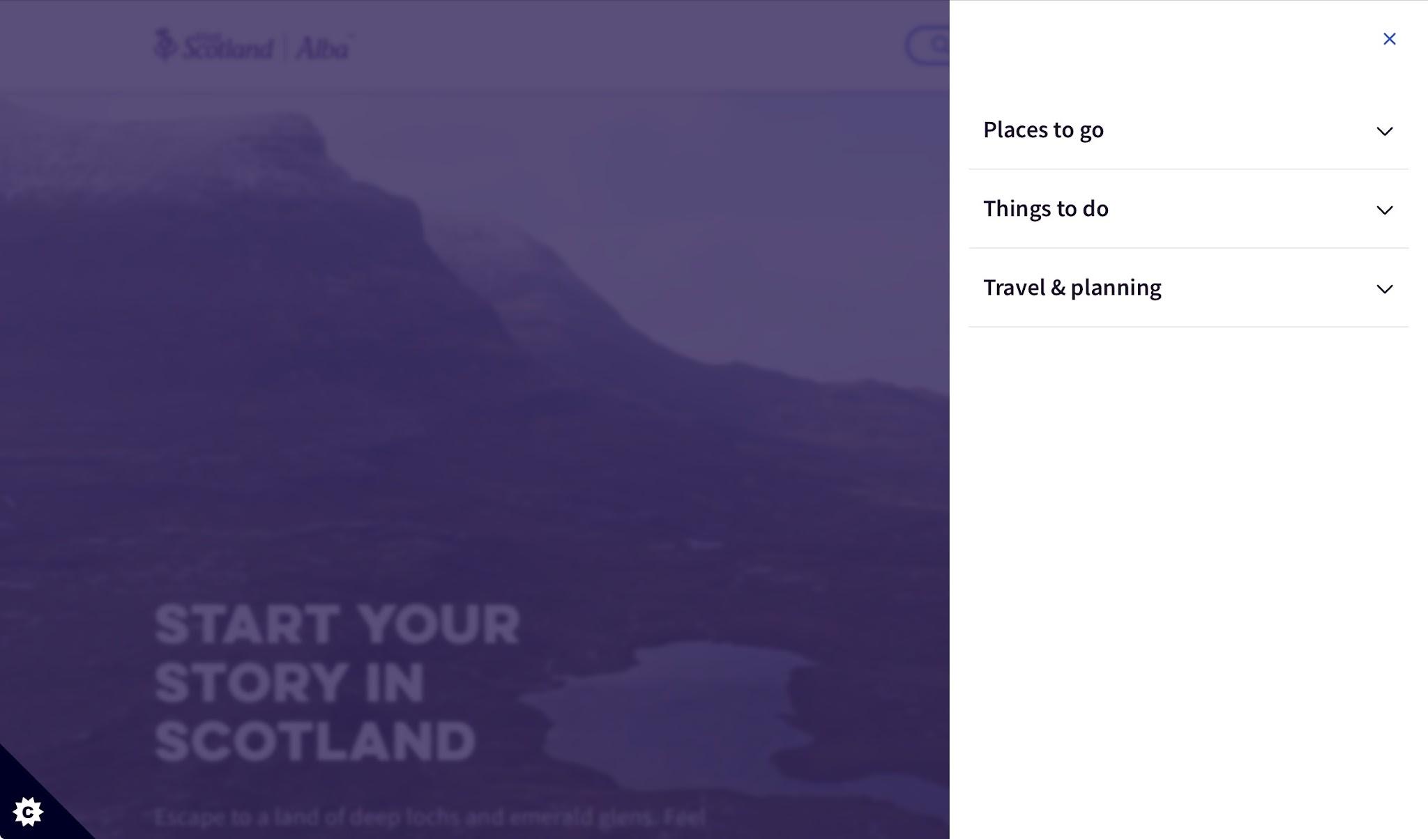
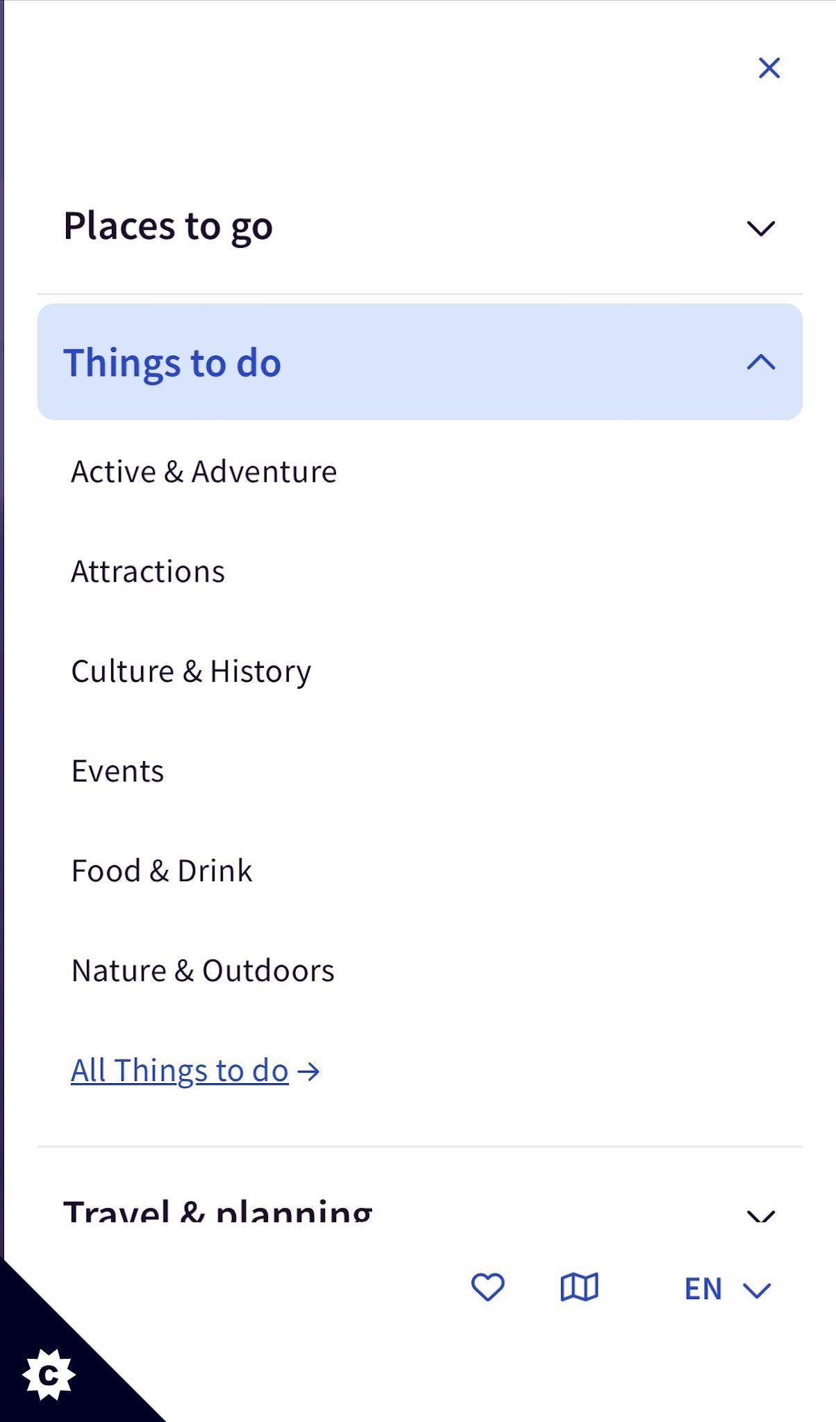
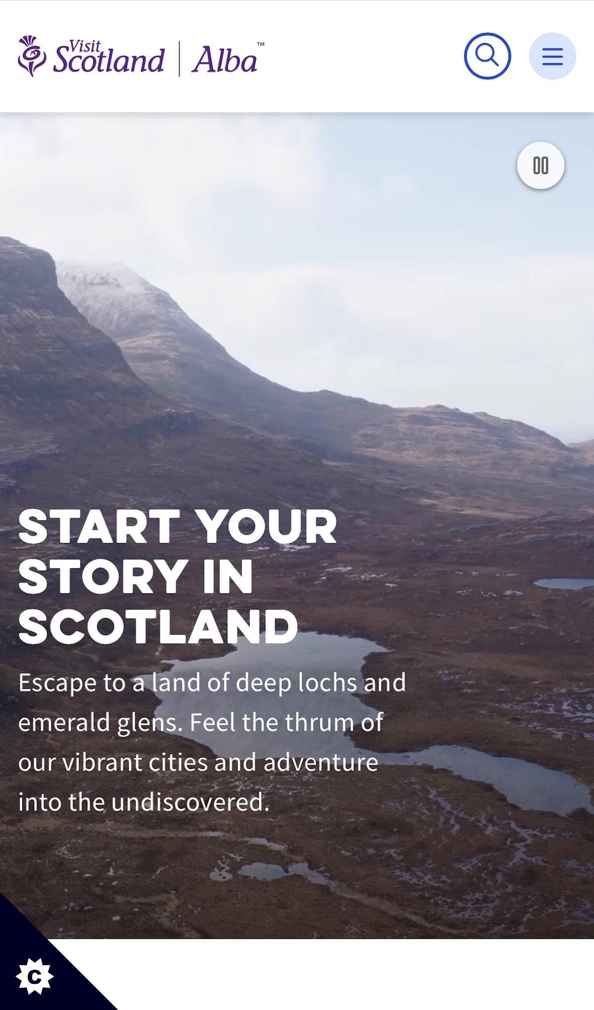
Moving away from an overwhelming mega menu to a more intuitive drop down design, that was consistent across devices and accessible.

Final thoughts and learnings
The research provided a clearer understanding of how users expected to navigate and discover information across the VisitScotland website.
By translating these insights into actionable recommendations, I helped inform improvements to the website’s information architecture and create a stronger foundation for more intuitive user journeys.
*This was part of a larger piece of work, reviewing the wider site structure.
The project reinforced the importance of validating information architecture against real user behaviour rather than relying on internal assumptions. It also highlighted the value of combining research methods to uncover deeper insights and using evidence to influence stakeholder decisions.
Using data metrics to validate this change over a period of time will really help to define its success.