Traffic Scotland
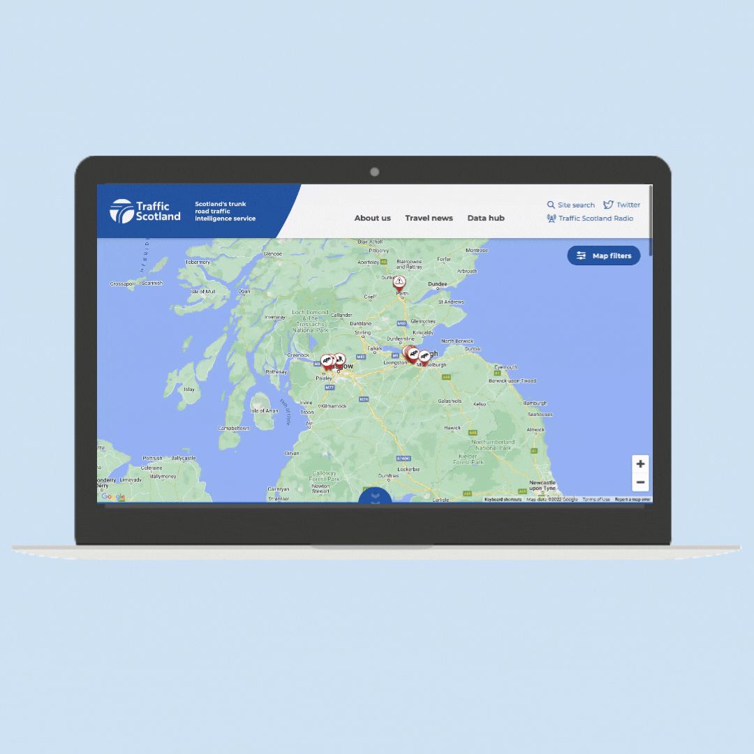
Redesign the Traffic Scotland website to be a responsive, trusted route planning tool for road users in Scotland.
Challenge
To create a mobile first web application, the primary function being to provide trusted, realtime route planning resources to road users. Tying in data from a number of providers and presenting to the user in a valuable and accessible format, without jargon.
Solution
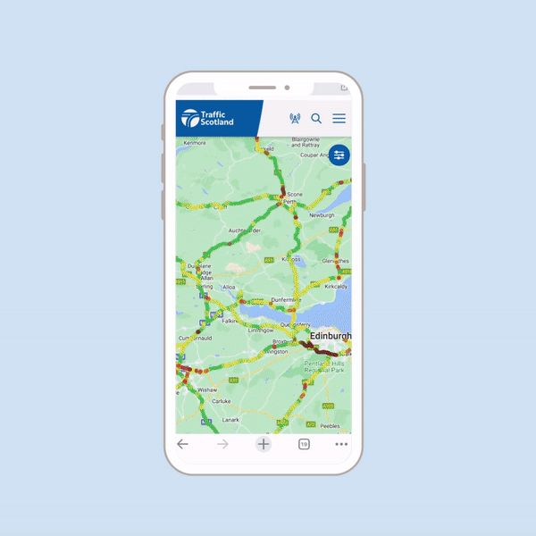
A completely revised, new mobile first web application, built with continuous user consultation that included a long term growth and development strategy.
The problem
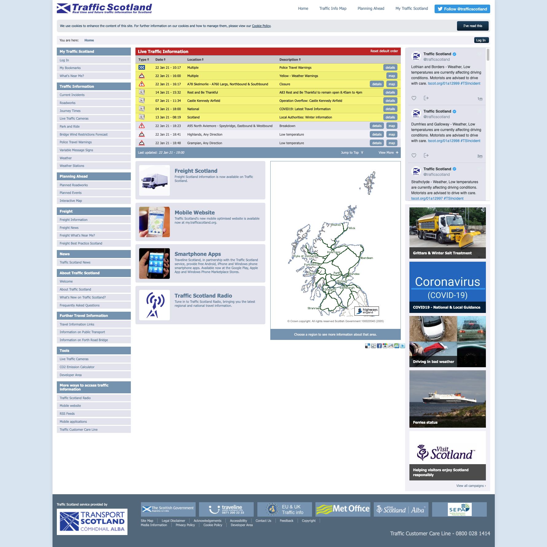
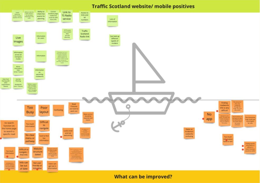
The Traffic Scotland website was tired and dated, unresponsive across devices, with poor functionality and usability. Accessibility was non existent.
Home to a host of valuable information, users found it incredibly difficult to navigate and find information.
It needed to be stripped back and started from scratch, designing a functional website with the user at its core while incorporating existing core functionality reimagined to be more engaging, intuitive, as well as accessible.
Discovery: Research & Analysis
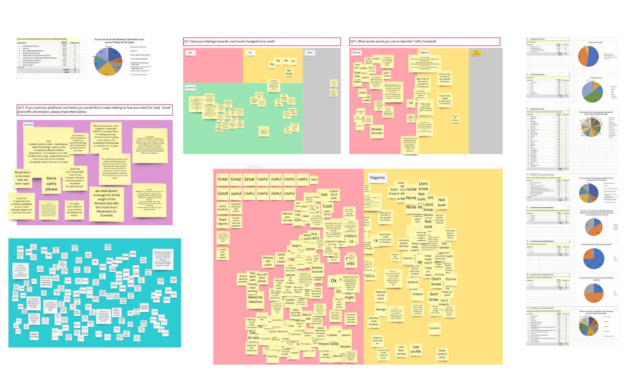
I lead the research for this project, and sought to validate if previous research completed was reflective of current road user opinion.
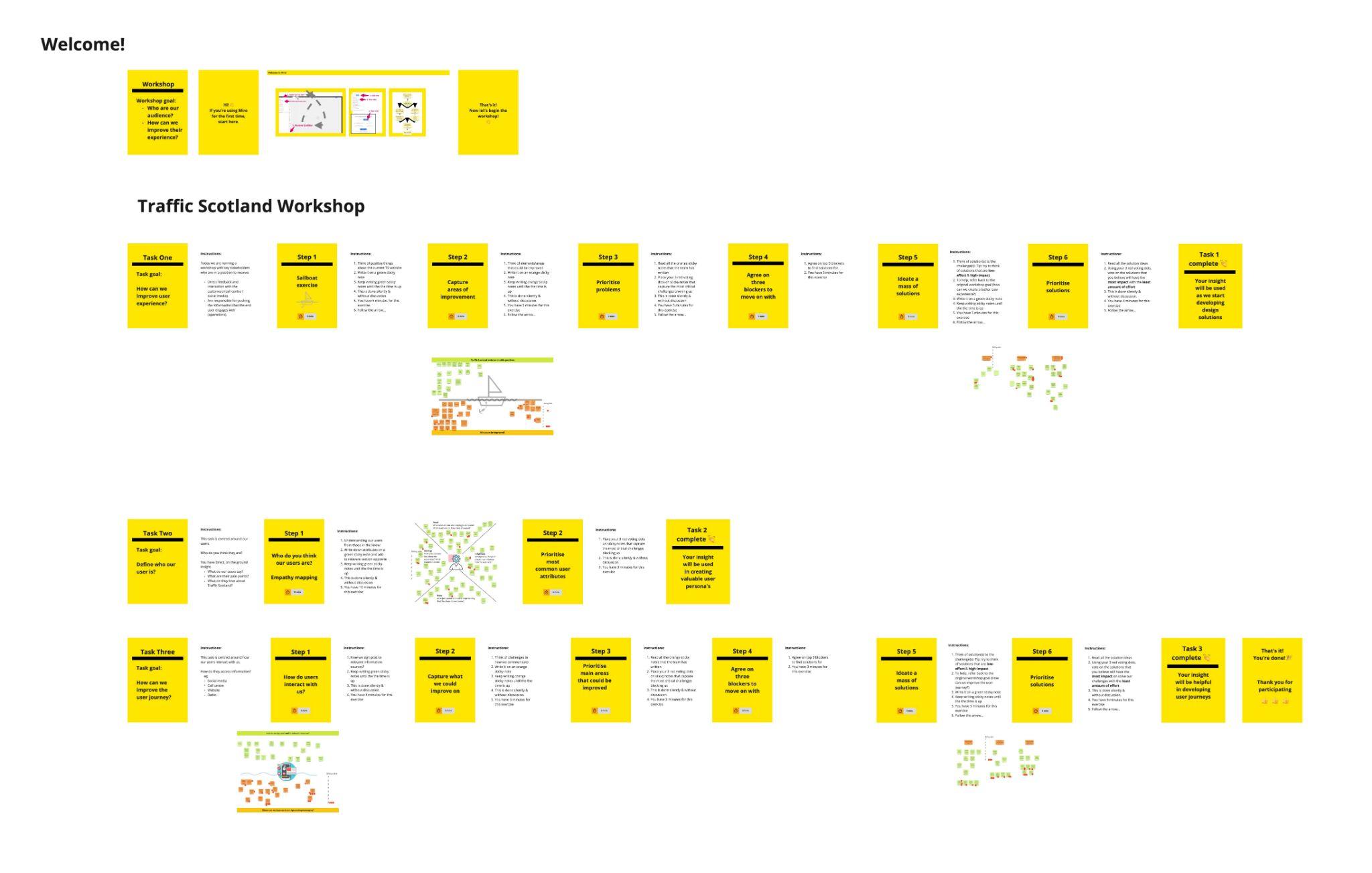
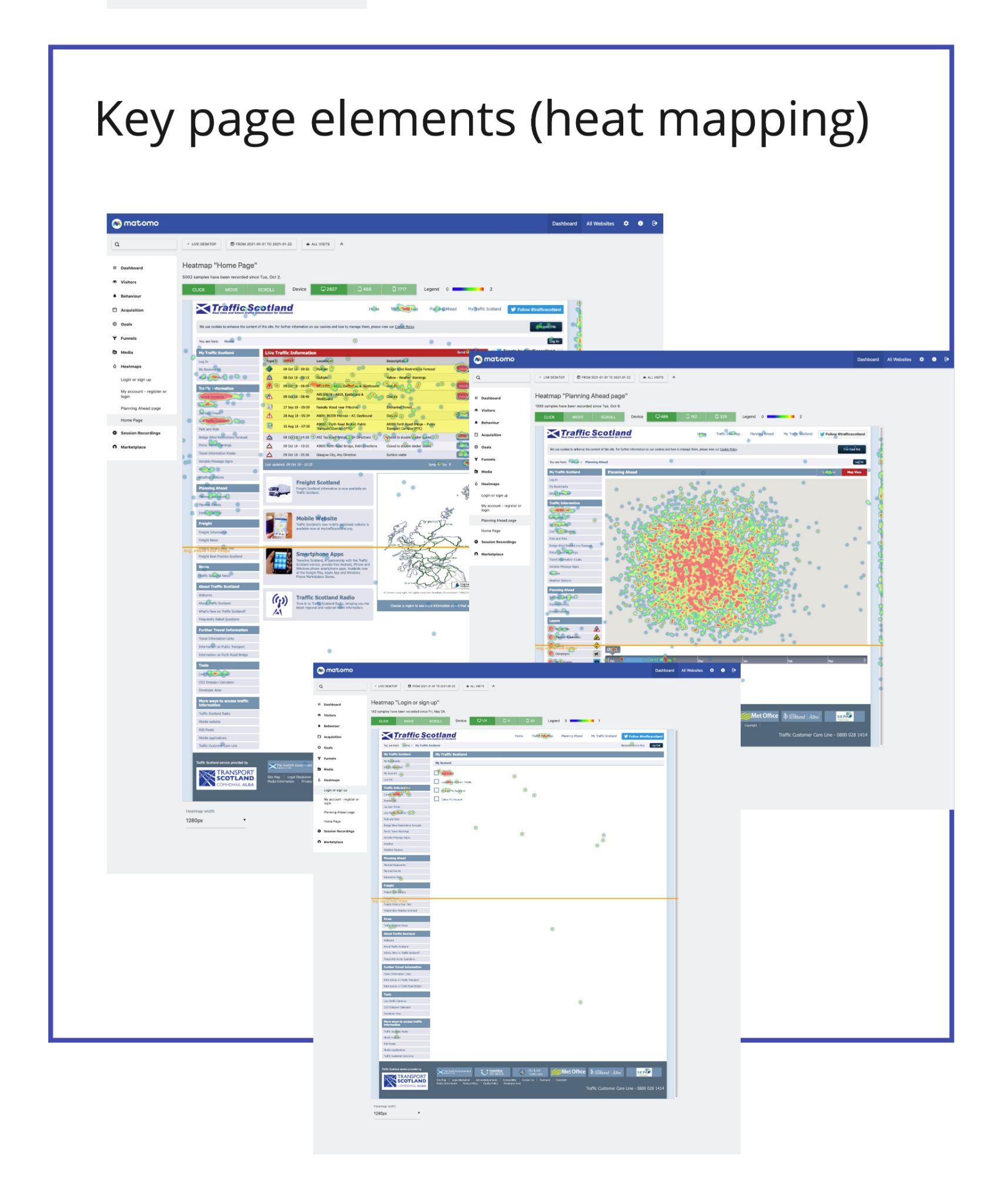
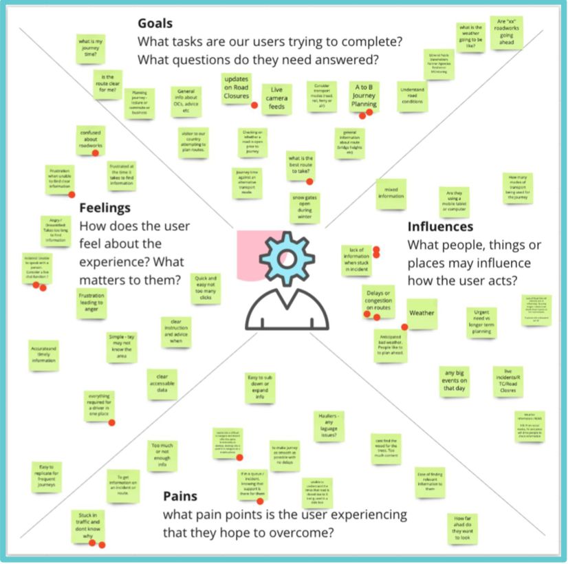
This involved desk research, user surveys, stakeholder workshops, analytical analysis and market research. This was especially important as all prior research was before covid-19, which was particularly impactful for road users, with less people on the roads and so was important to capture.
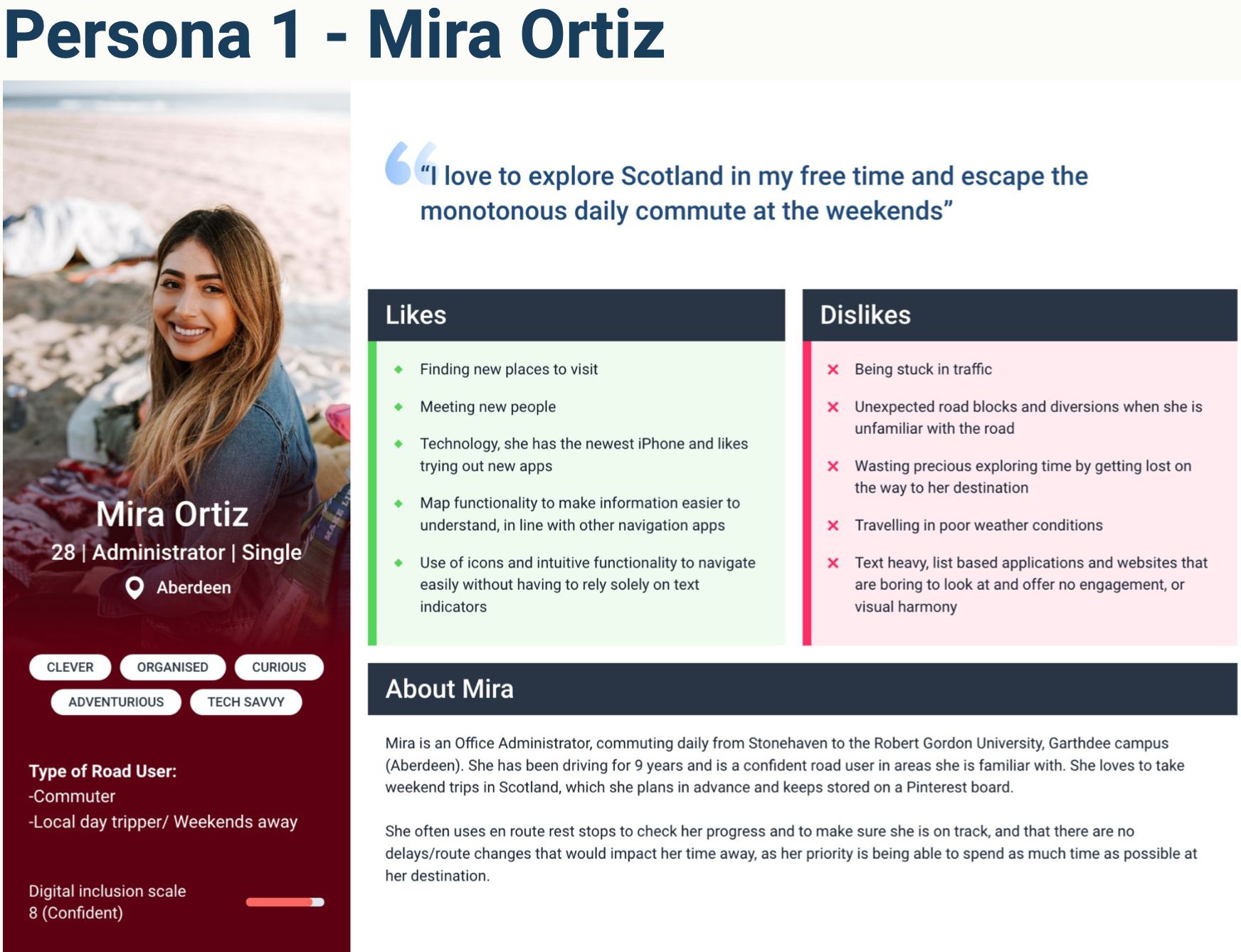
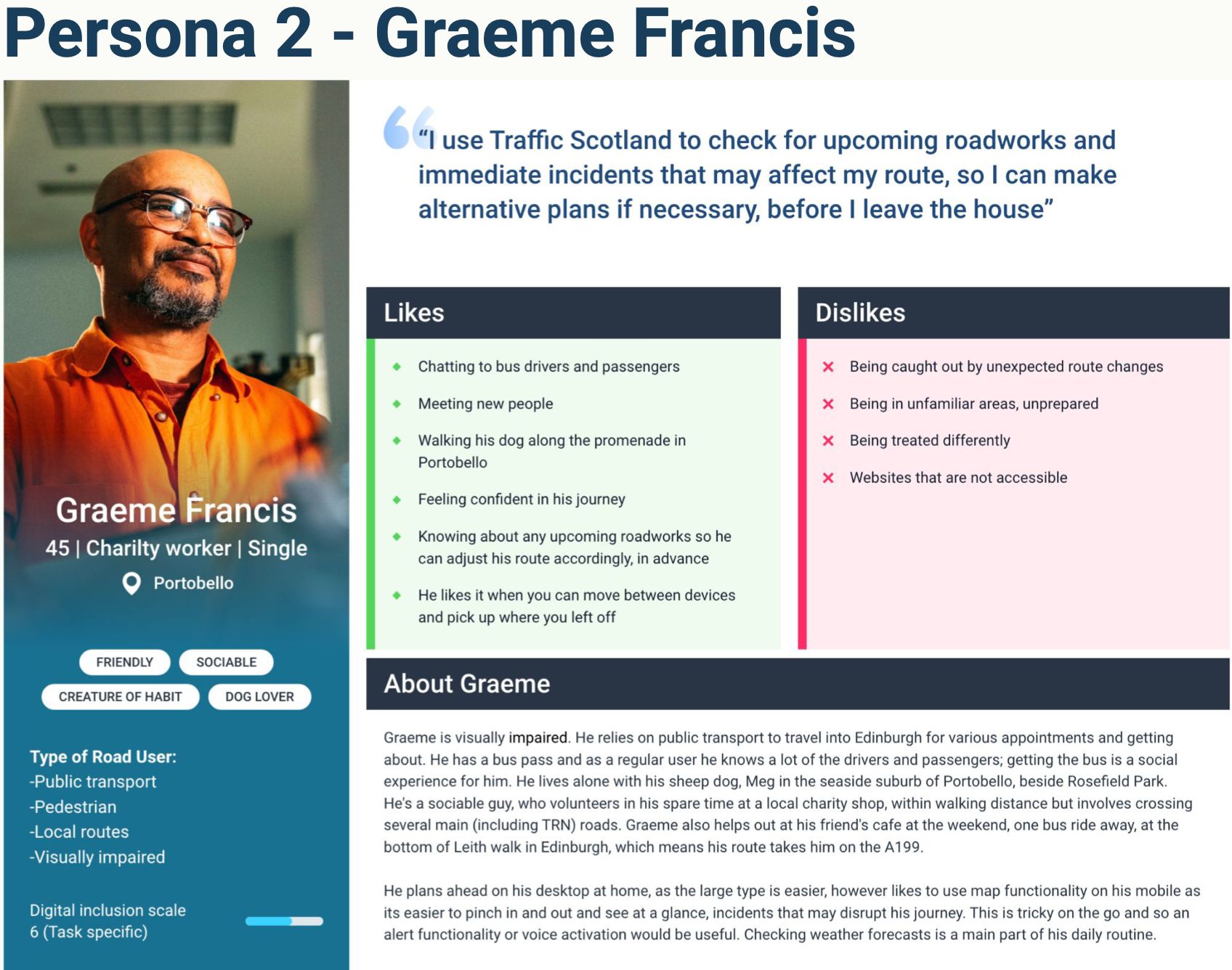
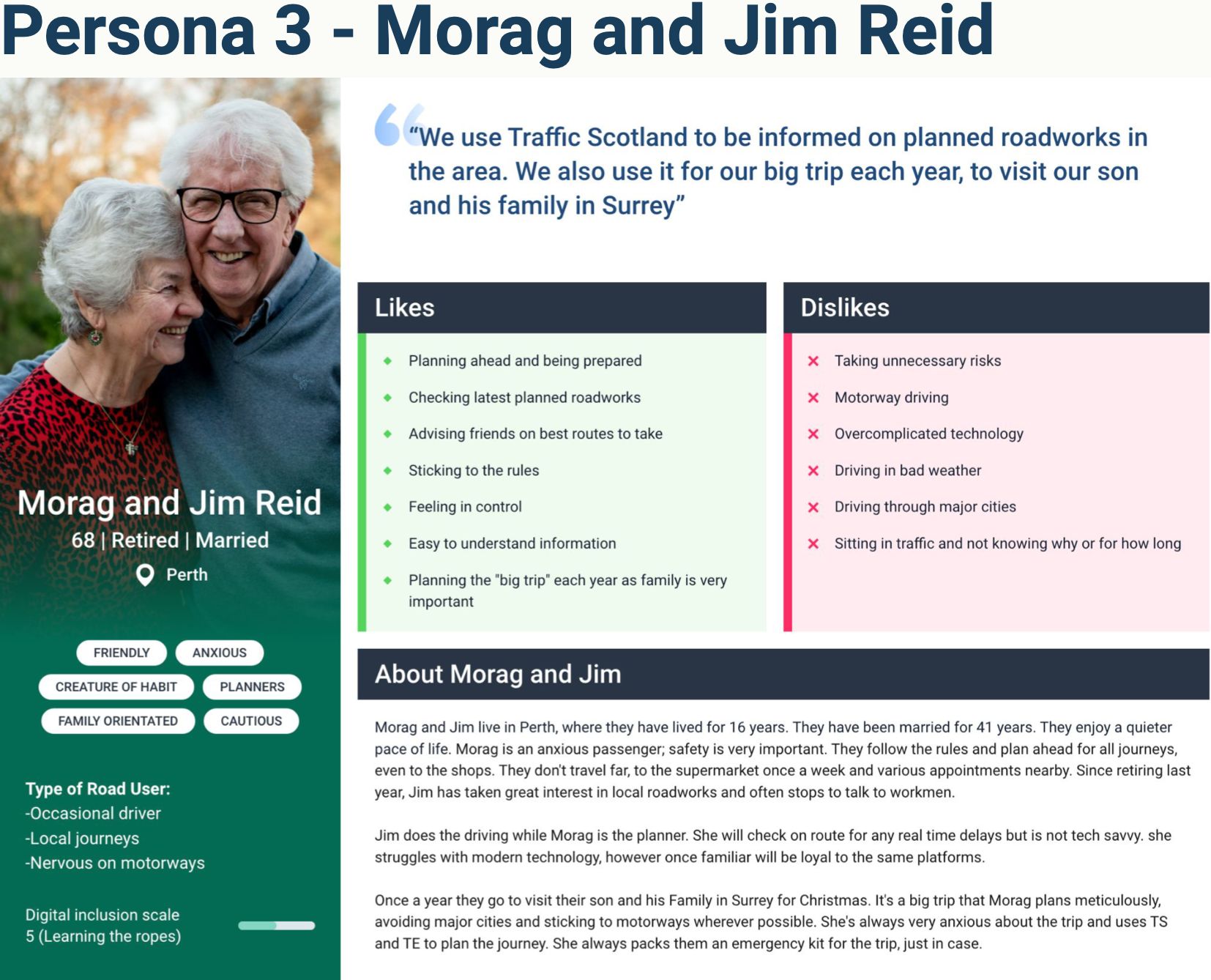
From this foundation I developed 3 user personas to reflect a meaningful representation of who our users were. This was a key part of the project as it not only humanised the process but also set a strong foundation for the design process.
Personas and user journeys
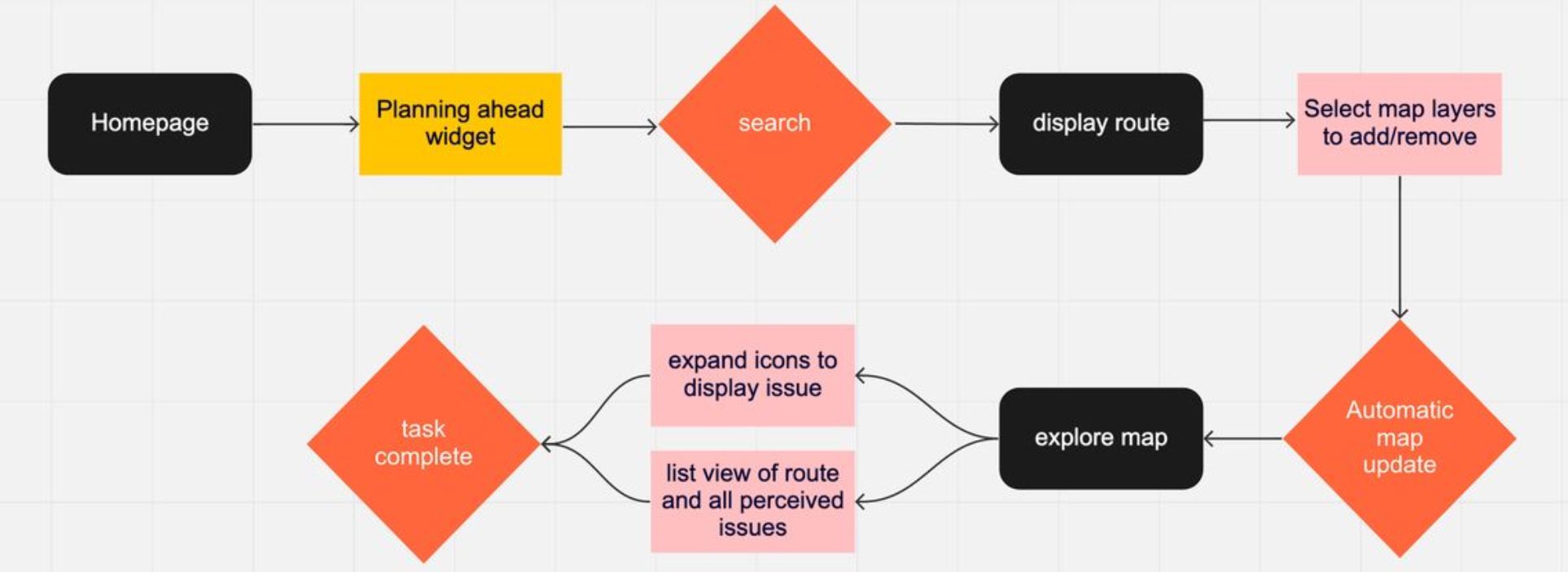
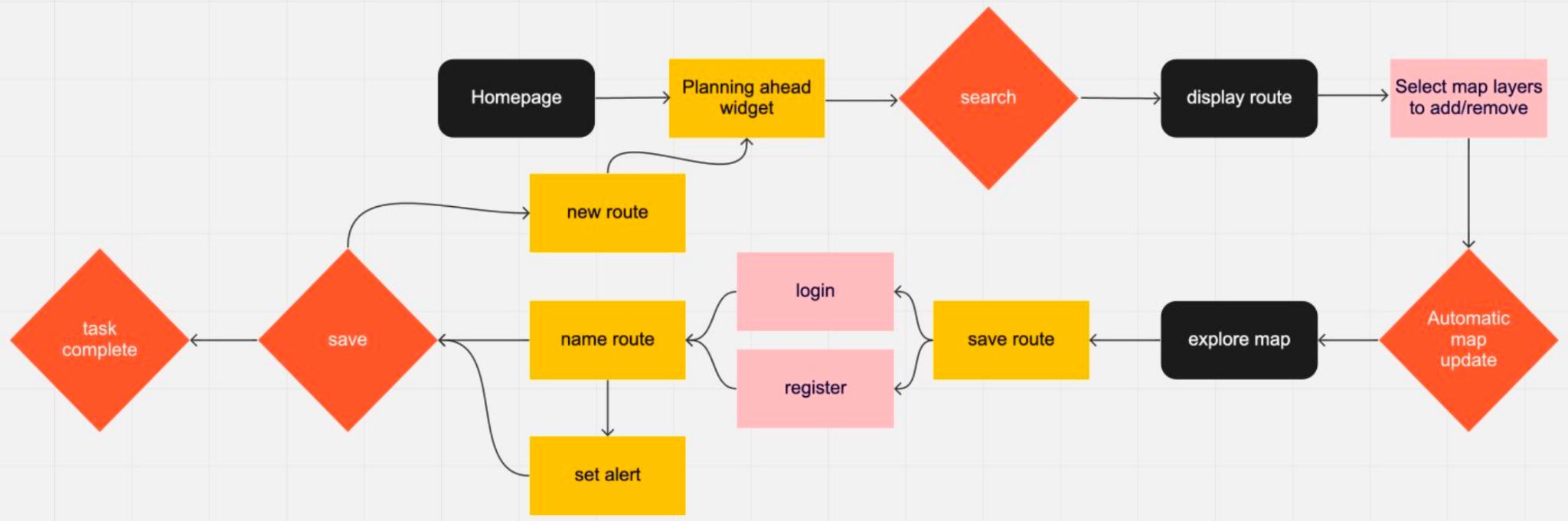
Personas and user journeys were created.

Development: User journey mapping
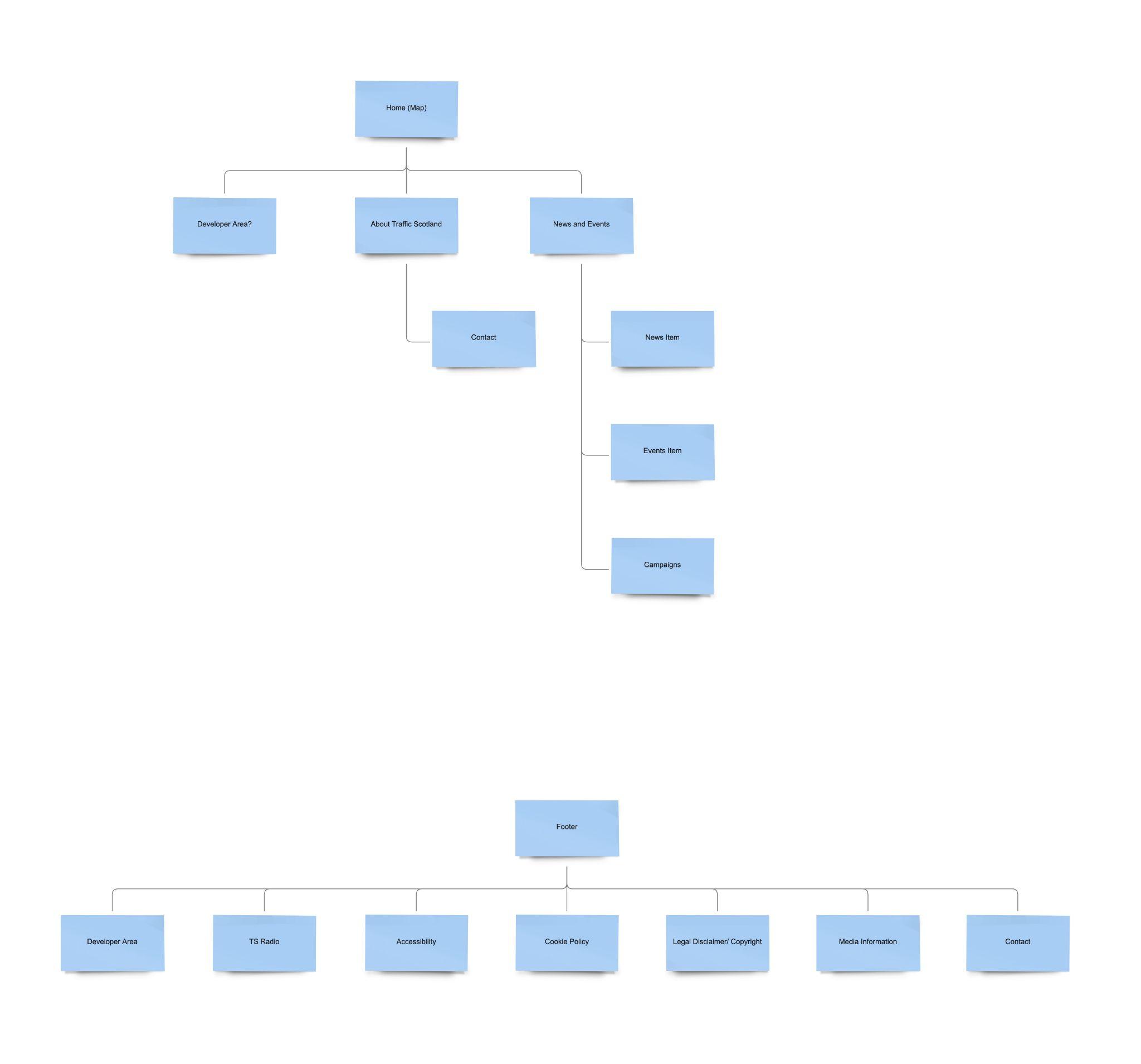
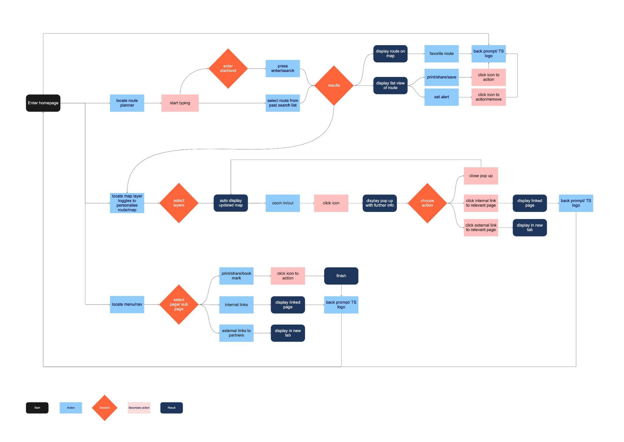
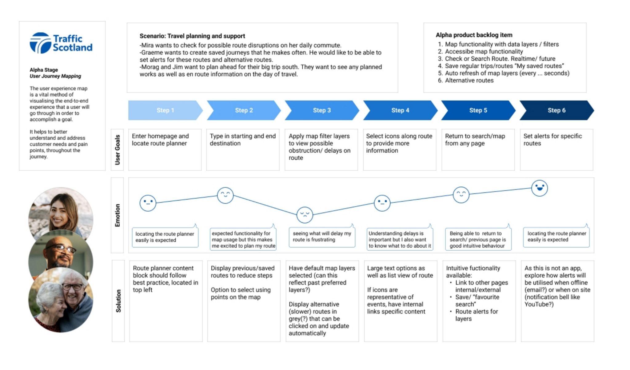
Using the personas, I mapped out site journeys that incorporated user needs. This was used to inform the site IA as well as a mapping document that outlined key functionality that formed the product backlog for Alpha.
This list was decided as part of a workshop that included the client, dev team and account managers, and myself.
This was a key part of outlining what key functionality and information would aid on site user experience. This followed though into the wireframe and design development, with each element of technical functionality traceable back to initial research.
Design: Wireframes
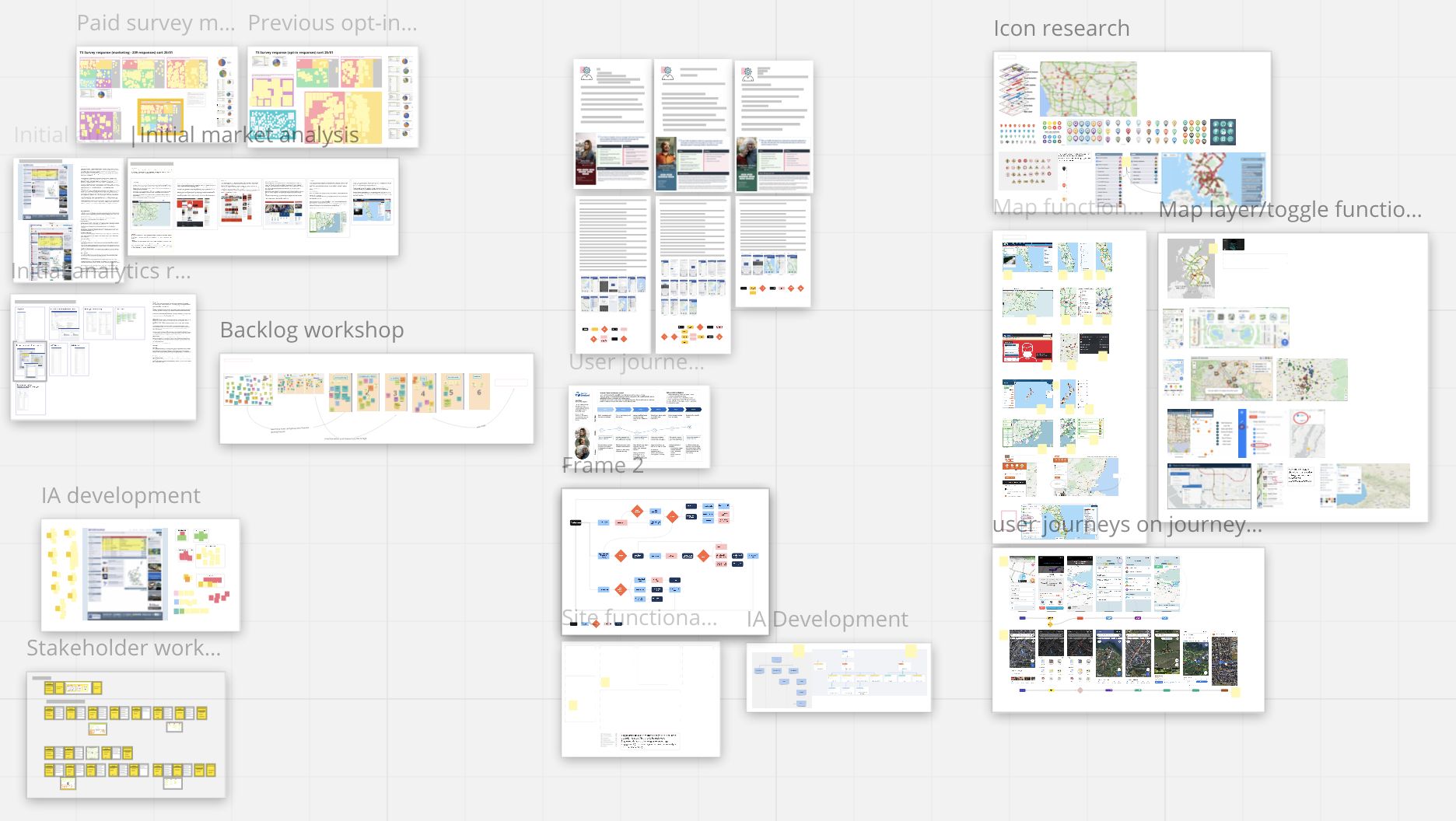
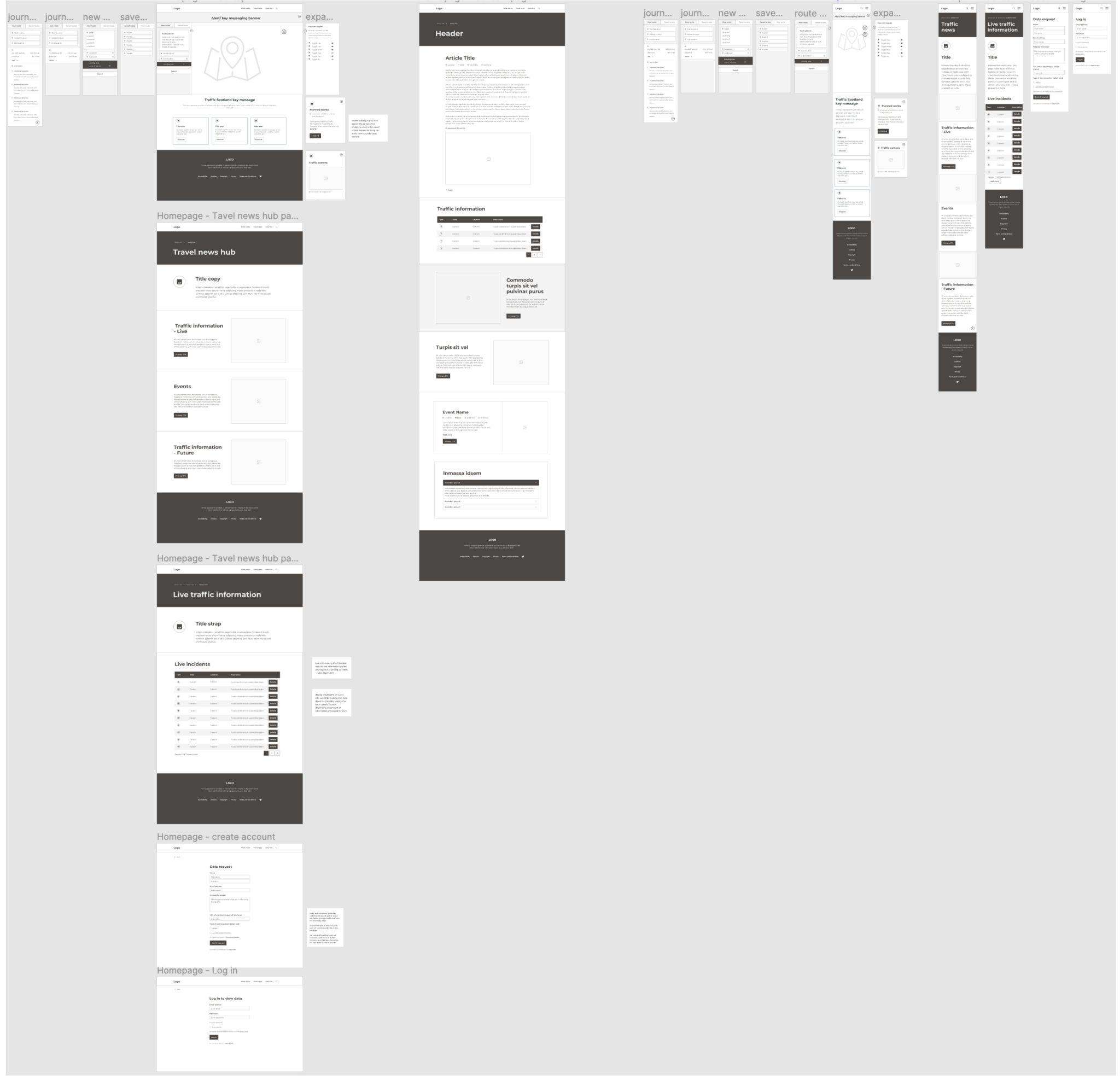
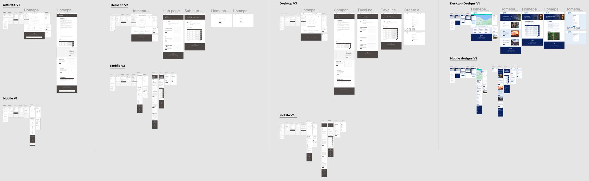
With the persona’s in mind, and with the wealth of information gathered during R&D (which I collated in one place on a Miro board for continual reference), I began mapping out the wireframes.
This was an ongoing process with multiple iterations as I continually conferred with dev and internal team, running the user journey through the designs. Once we were happy these were presented to client and stakeholders for sign off before external user testing began.
This feedback resulted in further iterations, ensuring functionality was revised with users in mind.
High-fidelity designs & Testing
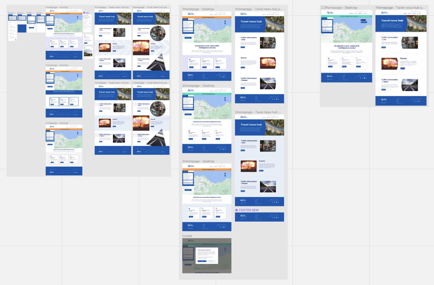
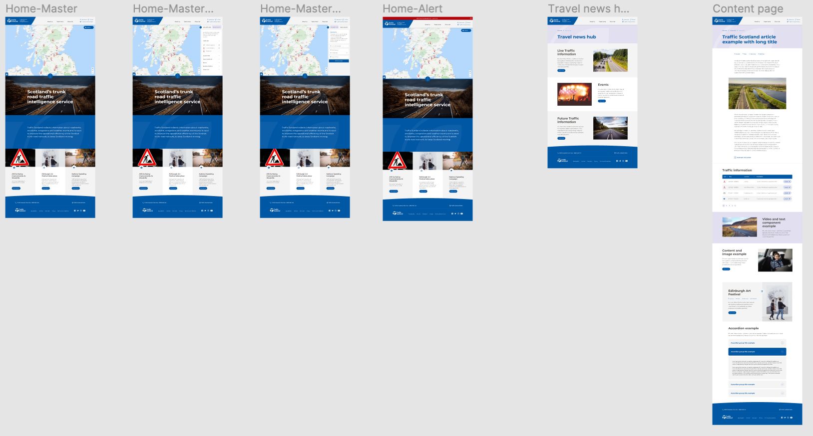
Following my initial wireframes a number of designers joined the process and worked on the high fidelity designs collectively as colleagues were also rebranding Traffic Scotland at the same time. I was involved as part of a larger team for this stage which included site and component designs, as well as icon development.
Throughout the process we carried out user testing with a group of testers to cover all persona types, as well as users with barriers to cover accessibility and users with low digital confidence. I oversaw interview scripts and testing strategy to ensure testing followed our defined user journeys. This feedback went on to inform iterations or long term monitoring strategies.
Final thoughts and learnings
This was a long term project completed over 18 months. It went through rigorous external testing as part of the DSSS assessment process required by government body sites of this nature.
It was a huge cross team and departmental project and I will look forward to seeing how it continues to develop and evolve as time goes on. The site will be an ongoing project with integrated user testing continually to ensure it performs highly for the user.
I really enjoyed this project as its rare that agency work spans such a timeframe. It allowed us as a team to really get to grips with each stage of the process, exploring all avenues to get the best result for client and more importantly the user.