Scotland Food & Drink
Desktop export directory to connect buyers (food export) with suppliers.
Challenge
To design and build an online trade directory to increase food export in Scotland.
Solution
To scope out current market and industry benchmarks for such a project, speak to users, and design a platform that compromised between both user need and client want, backed up with research. To deliver a phased rollout that includes continuous feedback and user centred approach to design and delivery.
The problem
Scotland Food & Drink were looking for a (food) export directory. A platform that would connect buyers from around the world, with suppliers here in Scotland.
They had three main user groups:
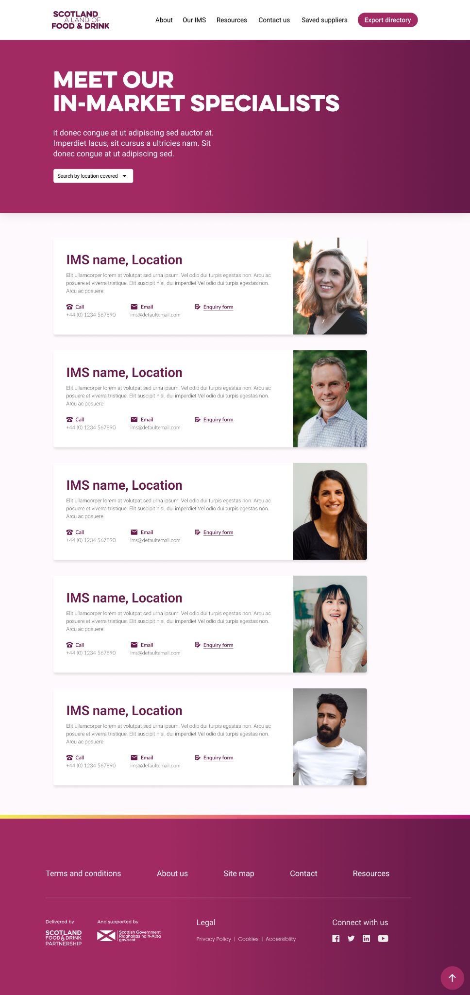
- In Market Specialists (IMS) — would be using the product to match buyers with suppliers and facilitate relationships.
- Buyers — would be looking to source items for their clients/locations.
- Suppliers — this platform would give them a place to direct trade as many do not have their own (or have the time/resource to upkeep).
Discovery: Research & Users
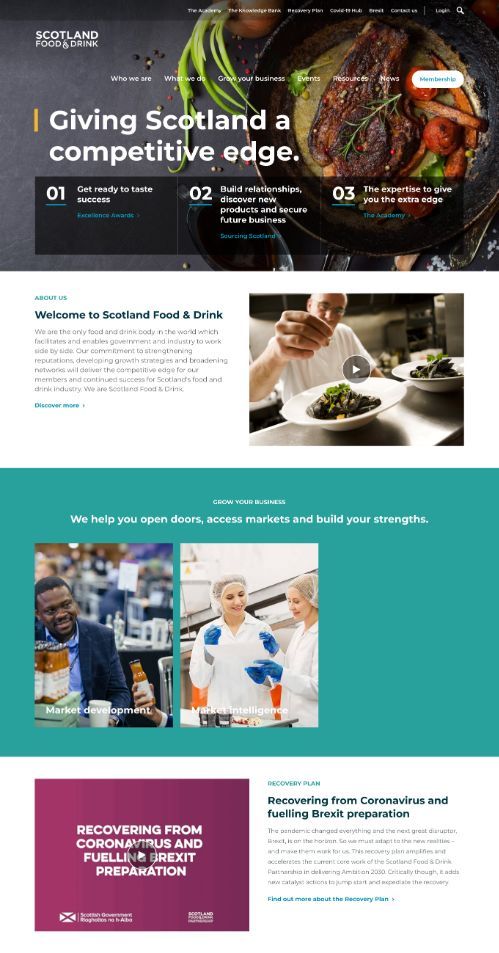
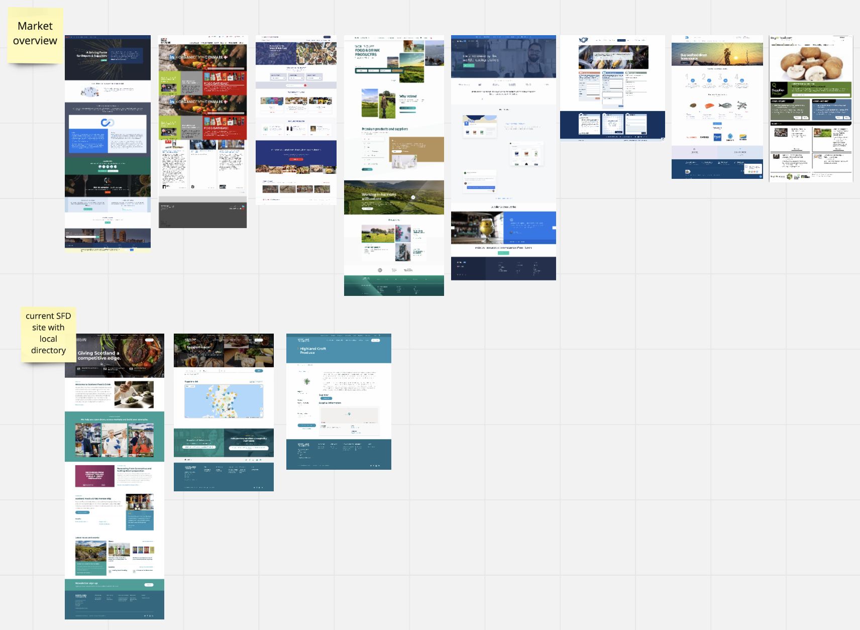
I began by having a look at what they currently offer, as an established brand I wanted to get a better feel for who they were. I also reviewed a few other export platforms to understand the market and start to map out key functionality that was coming up again and again.
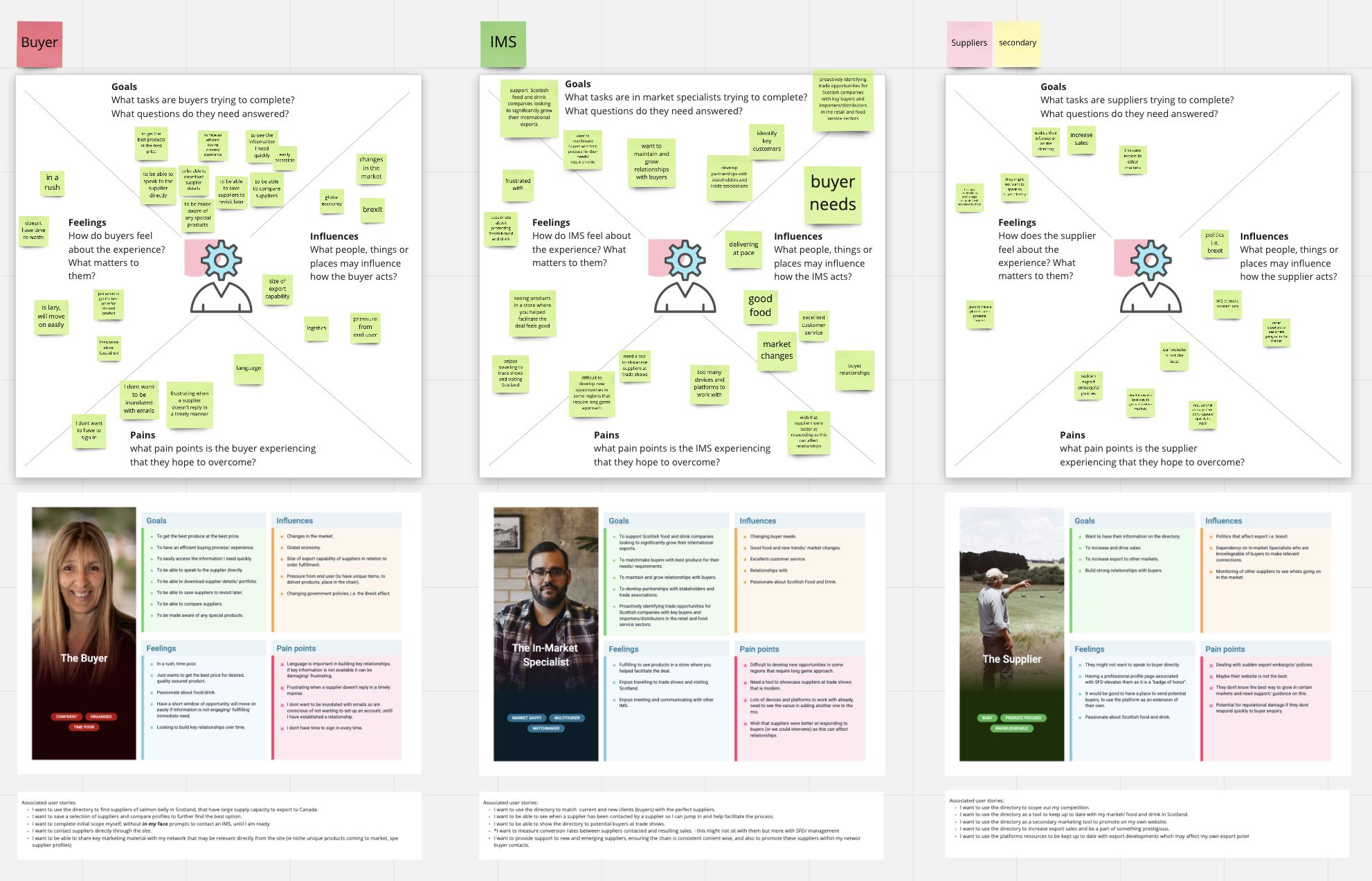
In tandem to this I worked with one of our planners to understand our users. We ran a series of workshops to understand what users need from a product like this.
We spoke only to the IMS for this due to time restraints and ease of access, ideally I would also have liked to speak directly with buyers however we did have an ex buyer as a stakeholder who was very useful at coming with a buyers perspective.
Development: Defining user journeys
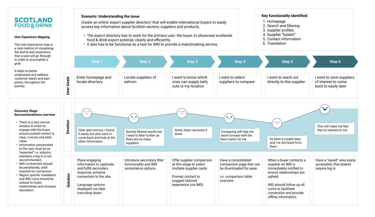
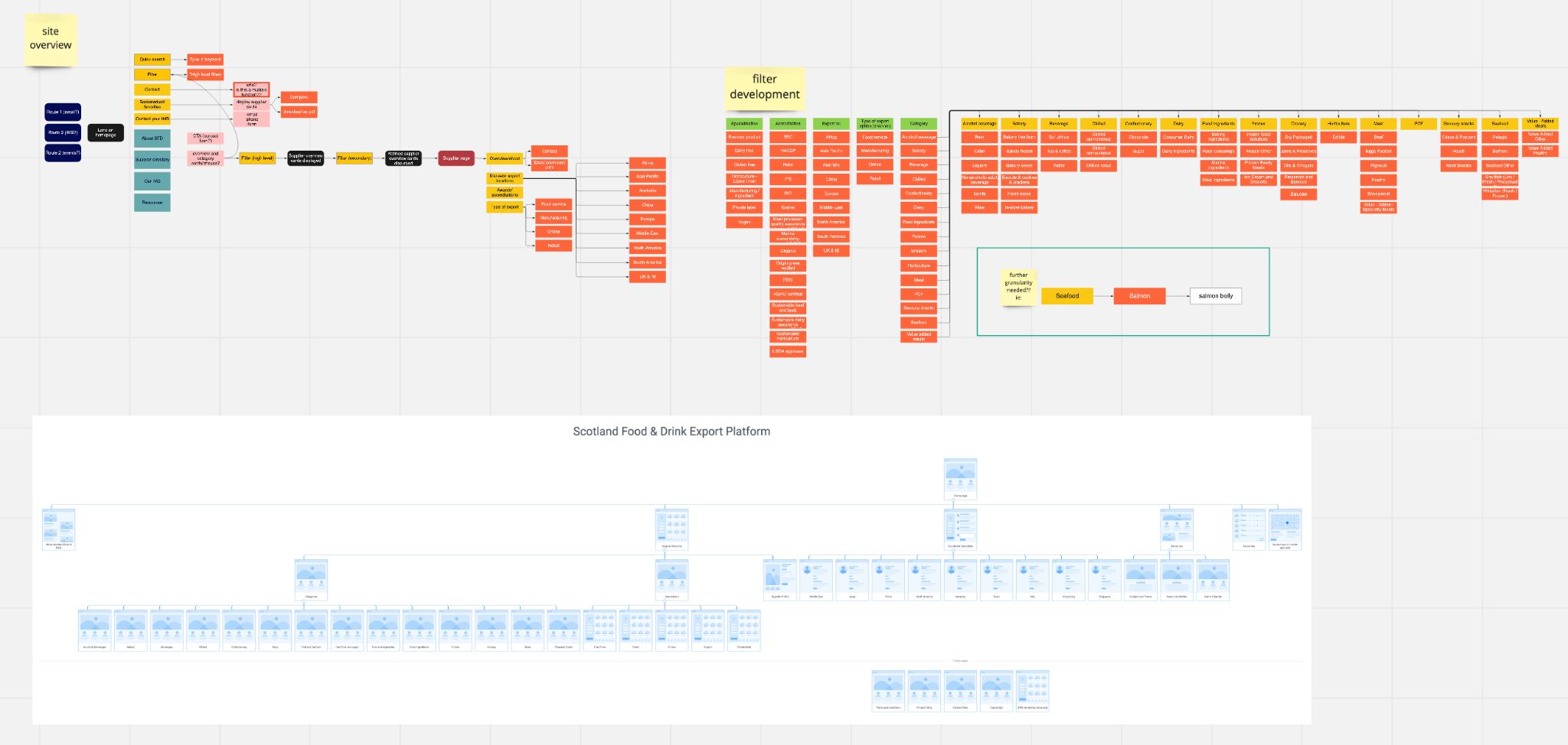
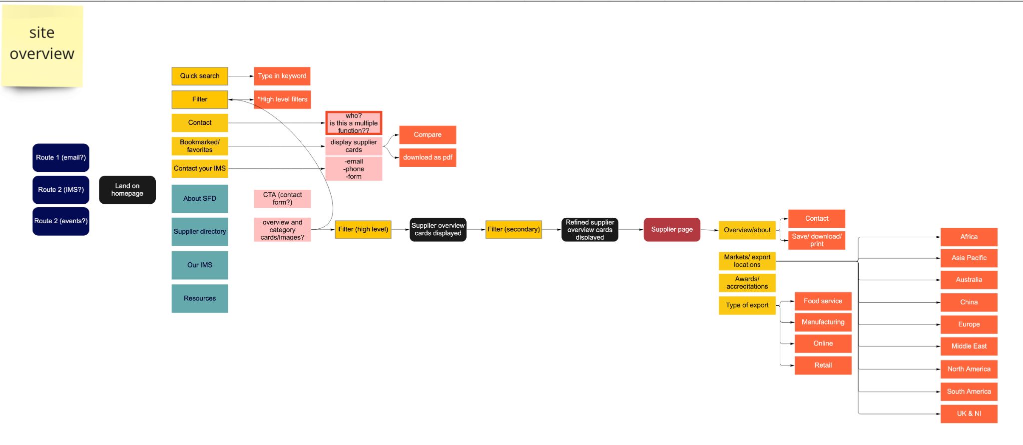
Once I had the high level persona’s outlined I began mapping out user journeys based on how each group were expected to use the site.
These journeys form the basis of the sites Information architecture (IA) and dictate the flow between pages, allowing a design where the user is accessing information as and when they need it, for a more intuitive experience.
As a final response to the discovery stage I created a journey map (see next slide). This gives an overview of checkpoints and key functionality/pages to include, and acts as a user road map throughout.
Development: Defining the IA and key functionality
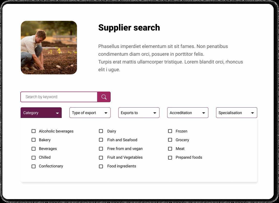
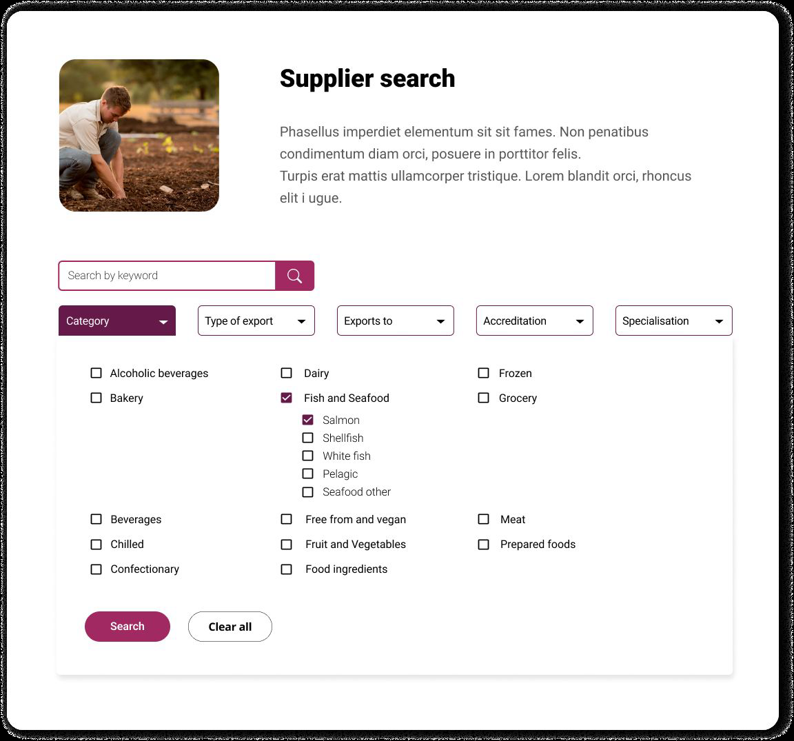
With this being quite a technical build I found that using the user journey really helped to define not only the IA (information architecture) but also the page structures. As this would essentially act as a directory, the key functionality overlapped with required content (i.e. displaying categories as a default as well as acting as filter).
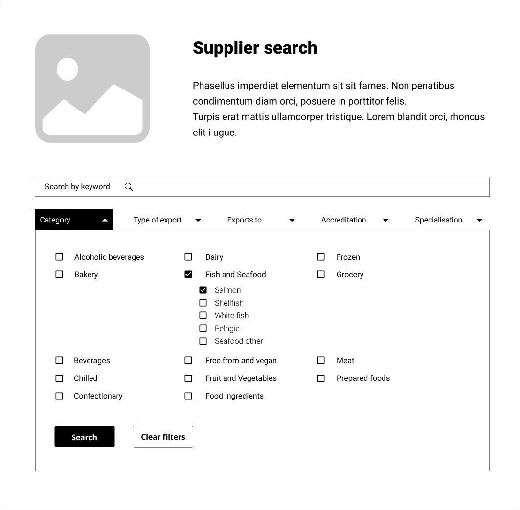
This allowed me to get to grips with the key filter function early on and map out the primary and sub fields, as well as record where this information may be displayed outwith the filters (i.e. supplier information cards).
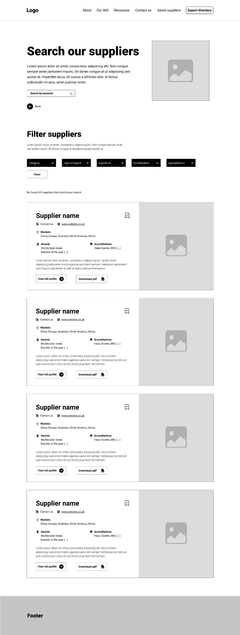
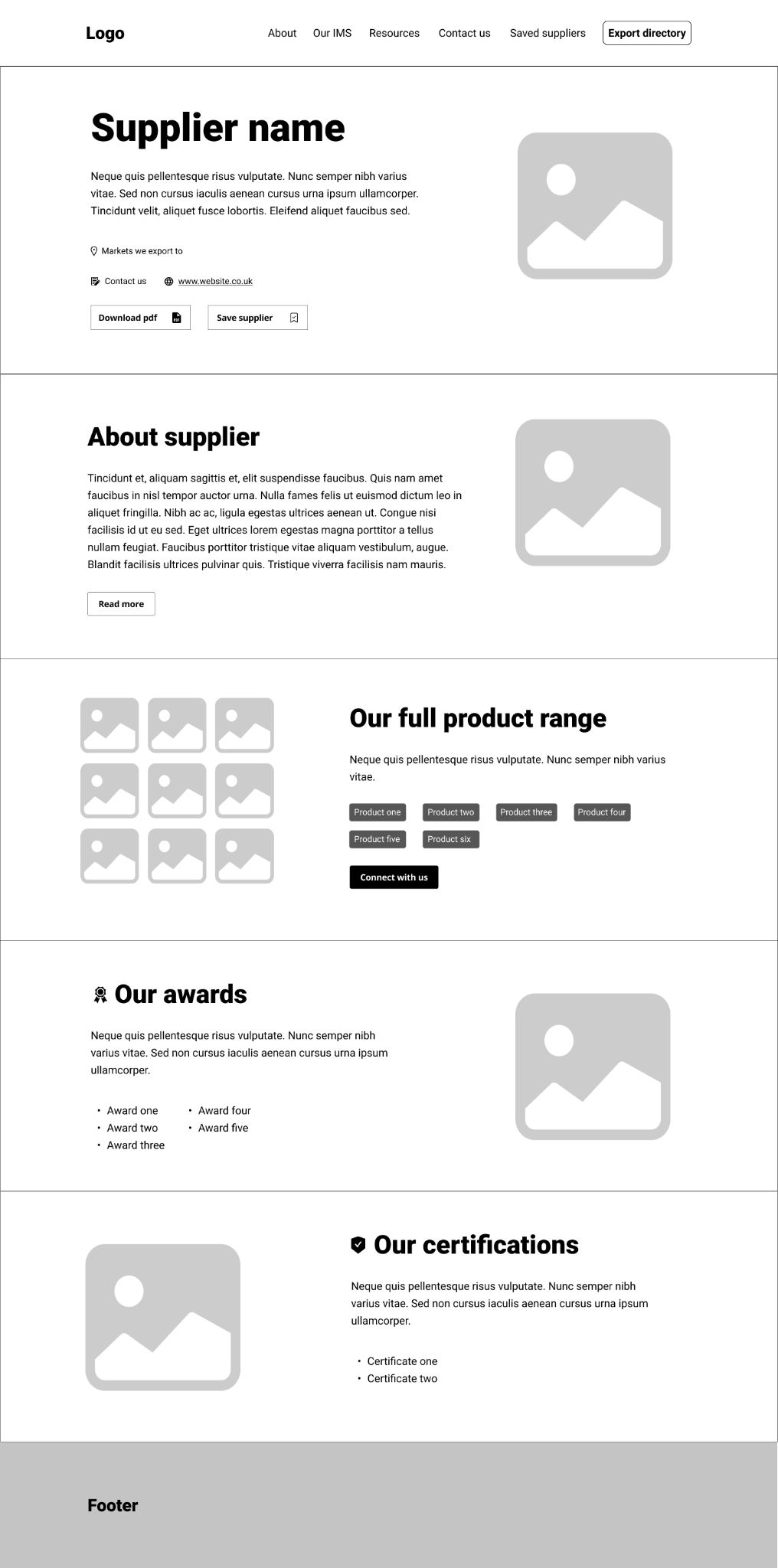
Wireframes
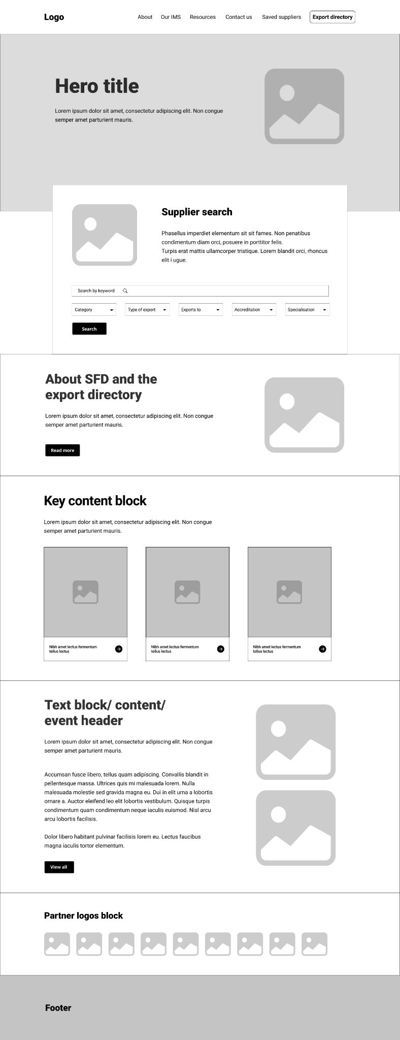
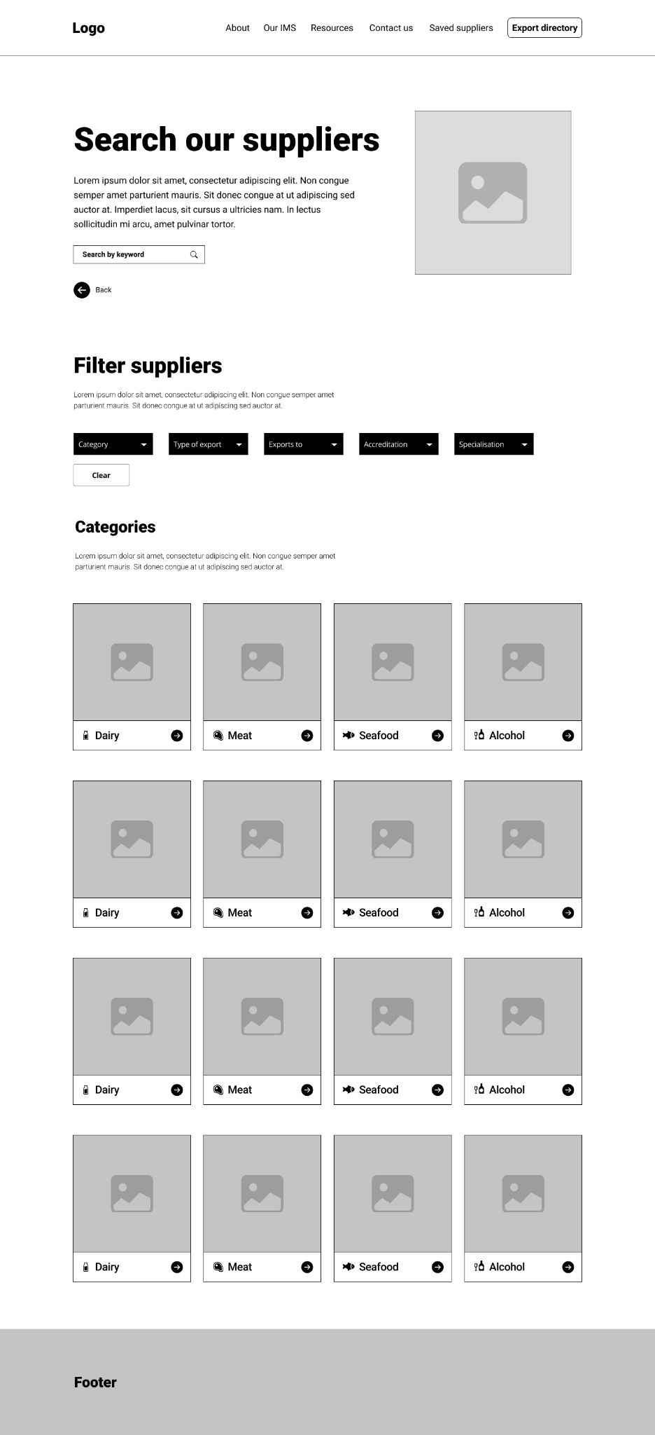
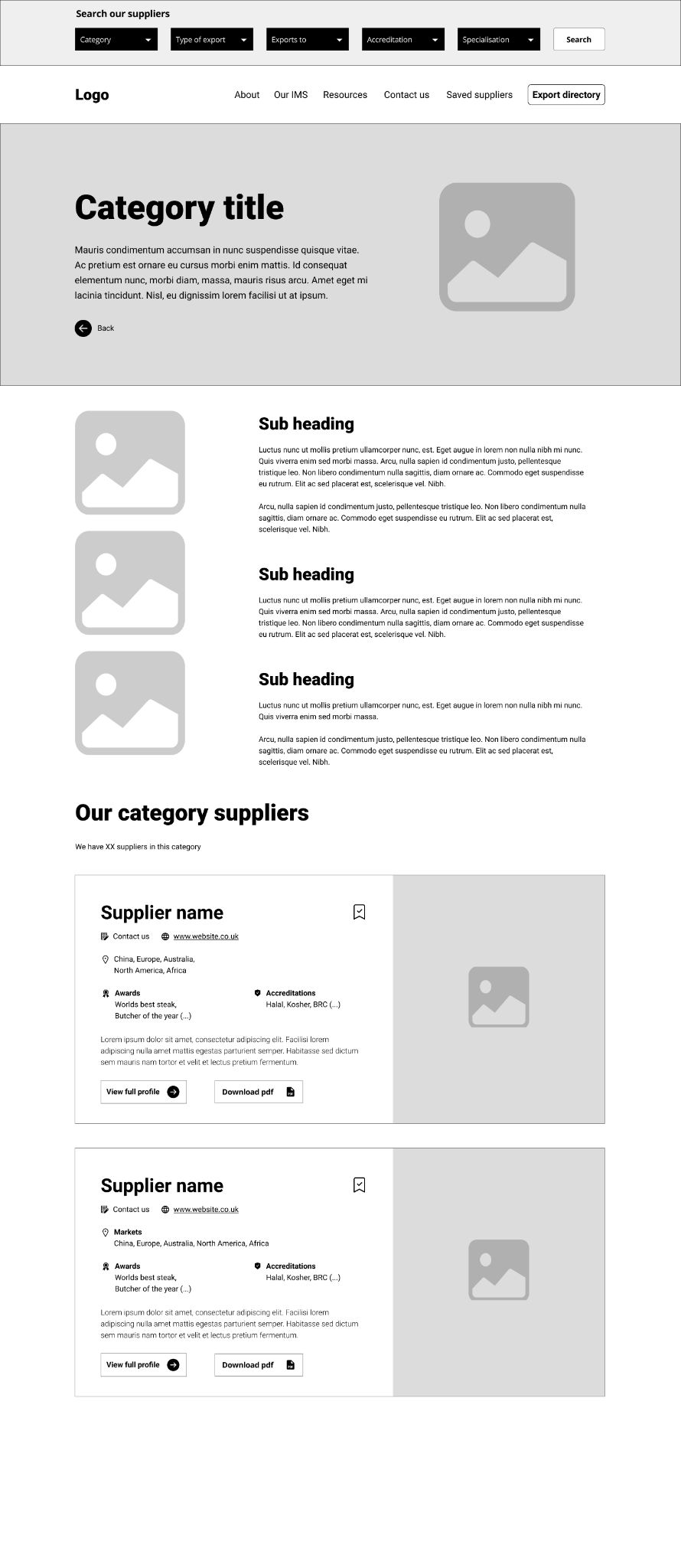
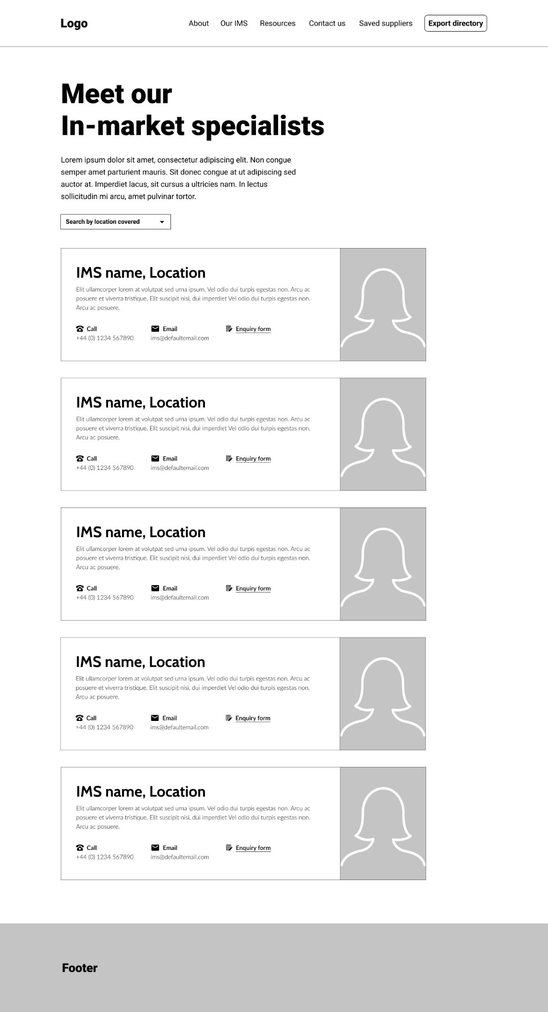
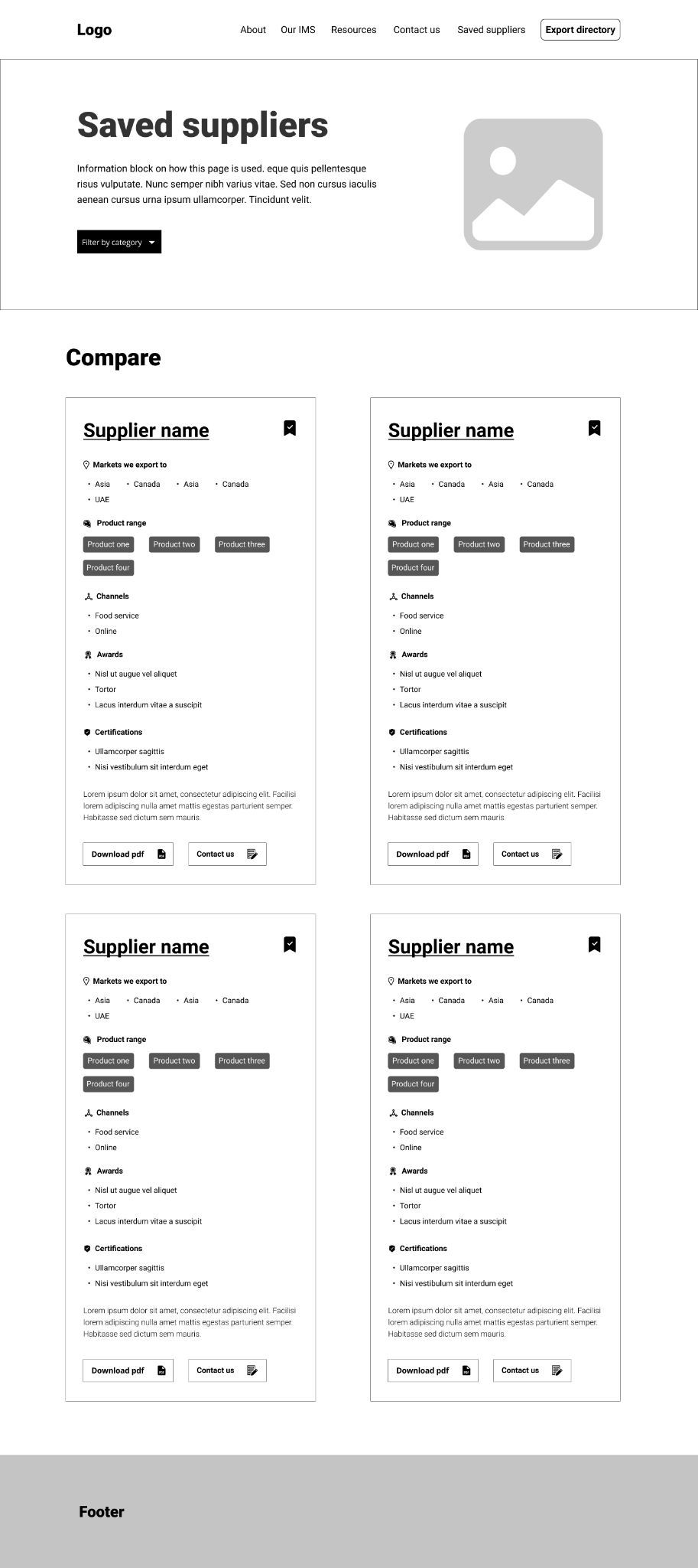
With all the groundwork laid the wireframes evolved naturally as I used all the research and development to map out the user journey as a series of pages with relevant components.
The creation of the wireframes was great as it was at this point the client could really see it coming together.
Once complete and signed off I prototyped the wireframes for user testing with the In Market Specialist user group (who we were informed would be our harshest critic as it would be them primarily using it).

High-fidelity Designs
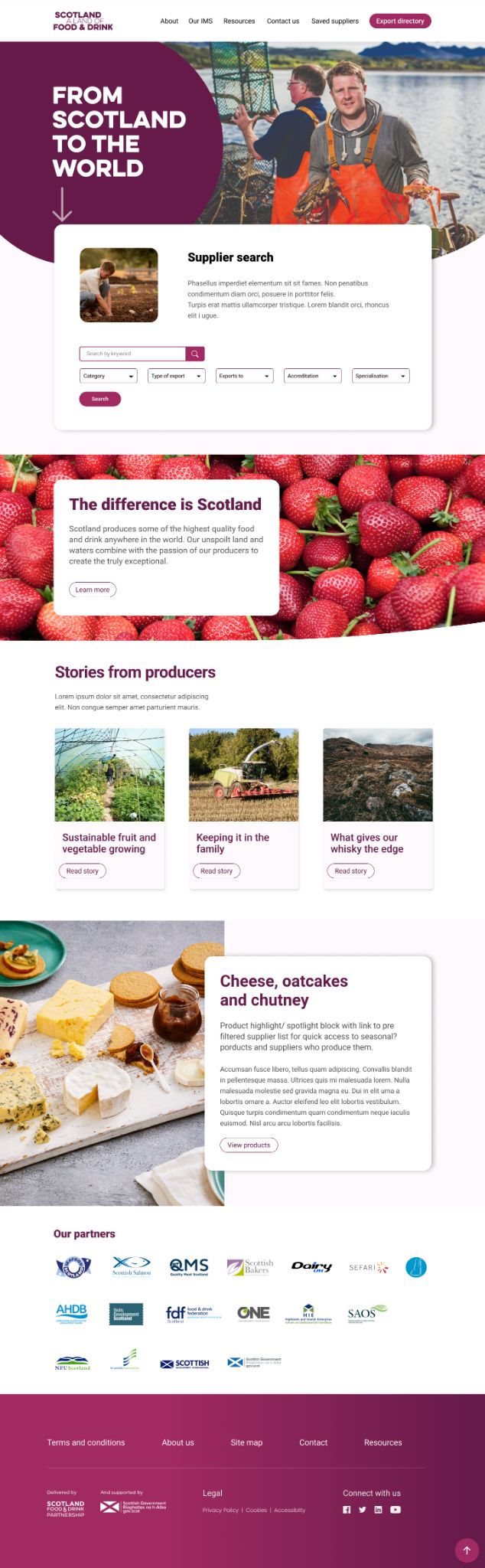
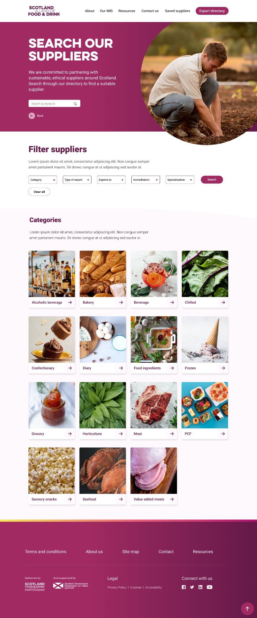
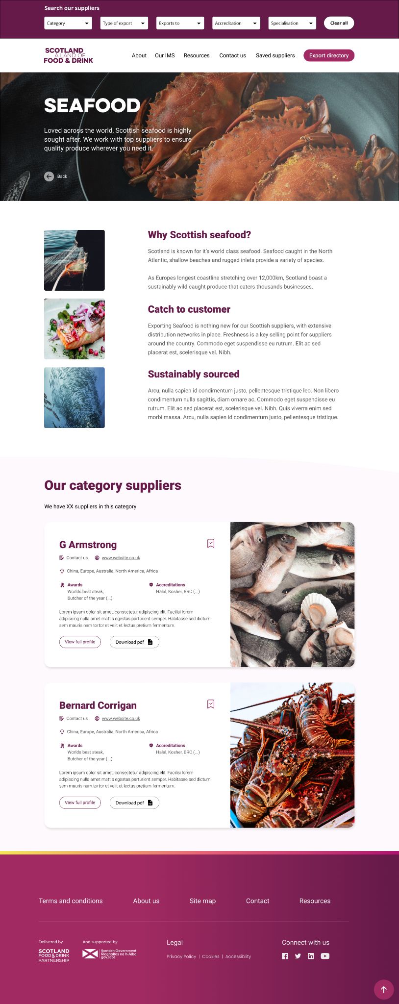
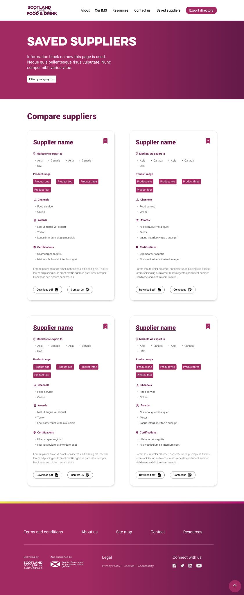
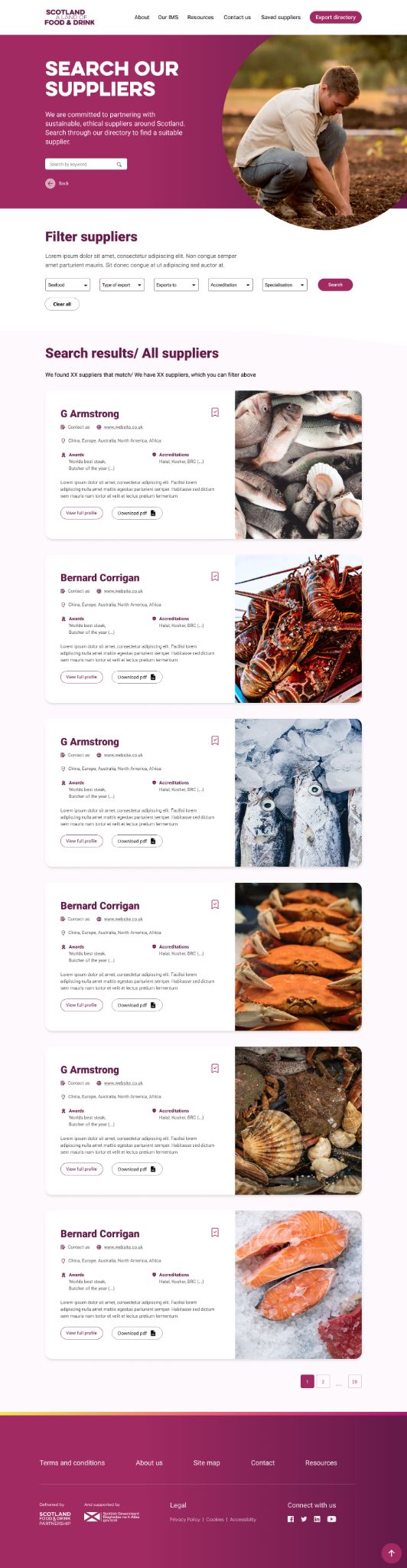
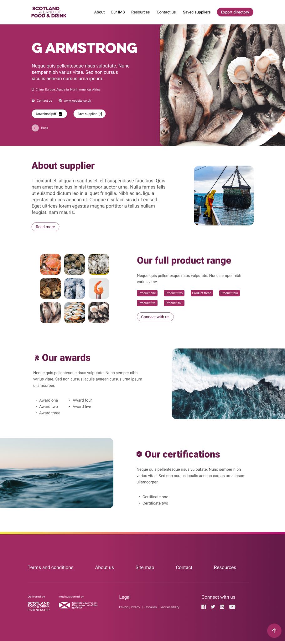
With user testing complete (luckily no further iterations were needed), I applied UI, using a pre-existing brand style guide and colour palette.
Once up and running this site will require a lot of content uploading, specifically with supplier details and produce information and photography, that will form the bulk of the directories content.
I would anticipate that future iterations to improve the service will take place as it evolves its offering.
Final thoughts and learnings
Lots of layers to this one, really enjoyable to break down the different elements needed and build up a product that relied on lots of parts coming together.
The first release was in 2022. With future developments in place to include language translation in key markets. This will be a great UX addition, especially in terms of fostering buyer relationships, which is a key function that the client is anticipating the directory will facilitate.
This was a project where the client were adamant that they knew the user and how they would use such a resource. Personally I would have liked to have expanded the user testing to include both buyers and suppliers as all users would provide beneficial input and viewpoints.
I’ll be curious to see how and if the site changes once it is in use by all users. As a UX designer a huge part of what I do is design based on research and testing. Its design based in evidenced logic that can be traced back. Not having that to the level I would have liked meant that I had to think outside the box and play on other aspects to make sure I was “getting it right”.